Toast 轻提示
介绍
在页面中间弹出黑色半透明提示,用于消息通知、加载提示、操作结果提示等场景。
TIP
阅读该组件文档前请确保已认真阅读快速上手章节的每一个字。
引入
ts
import { IBestToast } from "@ibestservices/ibest-ui-v2";代码演示
文字提示
点我查看代码
ts
@Entry
@ComponentV2
struct DemoPage {
build() {
Column(){
IBestButton({
text: '基础用法',
onBtnClick: () => {
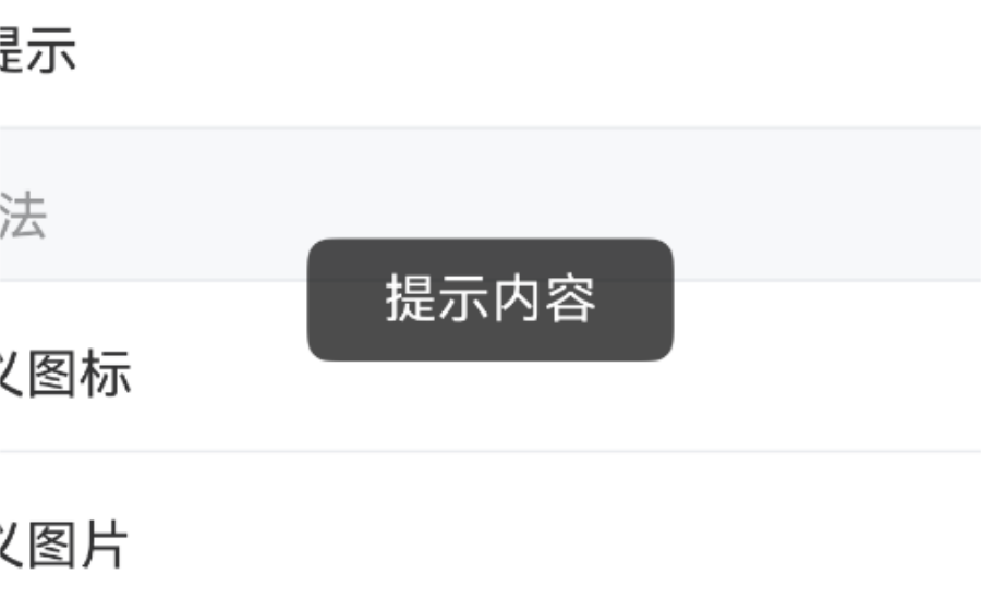
IBestToast.show("提示内容")
}
})
}
}
}成功提示
点我查看代码
ts
@Entry
@ComponentV2
struct DemoPage {
build() {
Column(){
IBestButton({
text: '成功提示',
onBtnClick: () => {
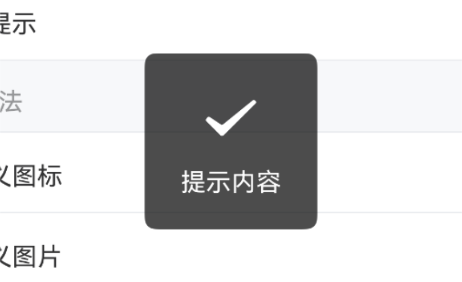
IBestToast.show({
type: "success",
message: "提示内容"
})
}
})
}
}
}警告提示
点我查看代码
ts
@Entry
@ComponentV2
struct DemoPage {
build() {
Column(){
IBestButton({
text: '警告提示',
onBtnClick: () => {
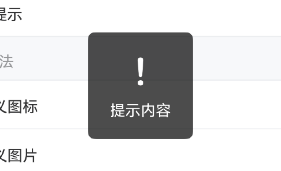
IBestToast.show({
type: "warning",
message: "提示内容"
})
}
})
}
}
}失败提示
点我查看代码
ts
@Entry
@ComponentV2
struct DemoPage {
build() {
Column(){
IBestButton({
text: '失败提示',
onBtnClick: () => {
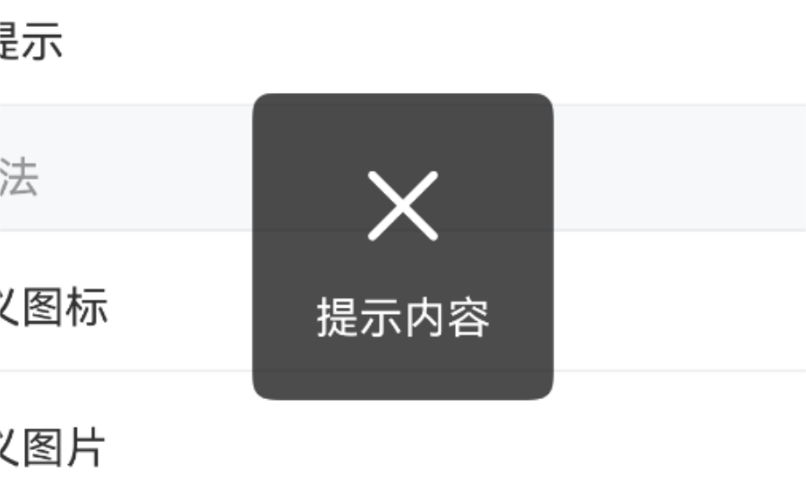
IBestToast.show({
type: "fail",
message: "提示内容"
})
}
})
}
}
}加载提示
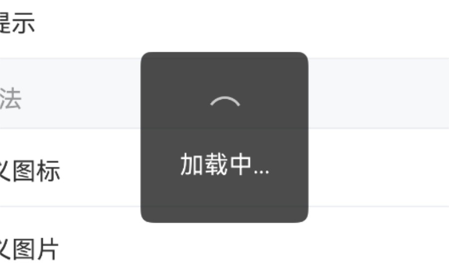
点我查看代码
ts
@Entry
@ComponentV2
struct DemoPage {
  build() {
    Column(){
      IBestButton({
        text: '加载提示',
        onBtnClick: () => {
          IBestToast.showLoading()
          setTimeout(() => {
            IBestToast.hide()
          }, 1500)
        }
      })
    }
  }
}
自定义图标
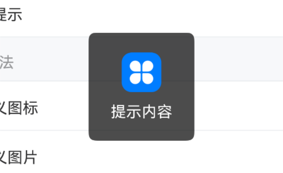
点我查看代码
ts
@Entry
@ComponentV2
struct DemoPage {
build() {
Column(){
IBestButton({
text: '自定义图标',
onBtnClick: () => {
IBestToast.show({
icon: $r("app.media.startIcon"),
message: "提示内容"
})
}
})
}
}
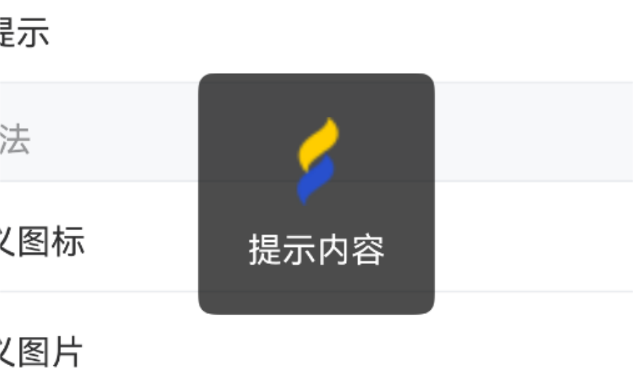
}自定义图片
点我查看代码
ts
@Entry
@ComponentV2
struct DemoPage {
  build() {
    Column(){
      IBestButton({
        text: '自定义图片',
        onBtnClick: () => {
          IBestToast.show({
            icon: "https://ibestui.ibestservices.com/favicon.ico",
            message: "提示内容"
          })
        }
      })
    }
  }
}
自定义加载图标类型

点我查看代码
ts
@Entry
@ComponentV2
struct DemoPage {
  build() {
    Column(){
      IBestButton({
        text: '自定义加载图标类型',
        onBtnClick: () => {
          IBestToast.show({
            type: "loading",
            loadingType: "spinner",
            message: "加载中...",
            onOpened: () => {
              // 可在此关闭loading
              console.log("toast打开成功")
            }
          })
          setTimeout(() => {
            // 也可在此关闭loading
            IBestToast.hide()
          }, 2000)
        }
      })
    }
  }
}
自定义位置

TIP
通过 position 属性可以自定义位置, 通过 offsetY 可设置偏移量。
点我查看代码
ts
@Entry
@ComponentV2
struct DemoPage {
  build() {
    Column(){
      IBestButton({
        text: '自定义位置',
        onBtnClick: () => {
          IBestToast.show({
            position: "top",
            offsetY: "20%",
            message: "提示内容"
          })
        }
      })
    }
  }
}
文字换行方式
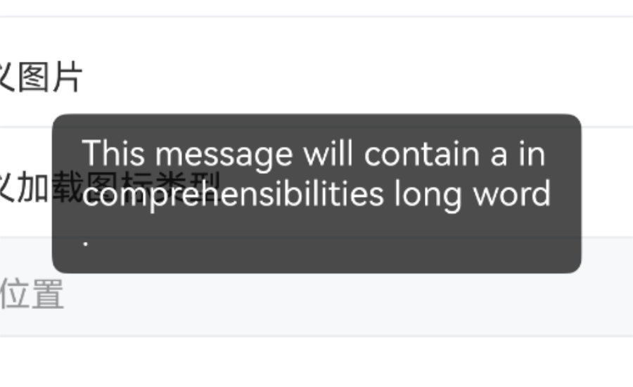
TIP
通过 wordBreak 属性可以设置文字换行方式。
点我查看代码
ts
@Entry
@ComponentV2
struct DemoPage {
  build() {
    Column(){
      IBestButton({
        text: '文字换行方式',
        onBtnClick: () => {
          IBestToast.show({
            wordBreak: "break-all",
            message: "This message will contain a incomprehensibilities long word."
          })
        }
      })
    }
  }
}
动态更新提示
点我查看代码
ts
@Entry
@ComponentV2
struct DemoPage {
  build() {
    Column(){
      IBestButton({
        text: '动态更新提示',
        onBtnClick: () => {
          let count = 3
          let toast = IBestToast.show({
            type: "loading",
            message: `倒计时 ${count} 秒`,
            duration: 0
          })
          let timer = setInterval(() => {
            count--
            if (count) {
              toast.message = `倒计时 ${count} 秒`
            } else {
              clearInterval(timer)
              IBestToast.hide()
            }
          }, 1000)
        }
      })
    }
  }
}
API
方法
| 方法名 | 说明 | 参数 | 返回值 |
|---|---|---|---|
| show | 展示提示 | option: ResourceStr | ToastOption | toast 实例 |
| showLoading | 展示loading | option: LoadingOption | void |
| hide | 隐藏提示, 异步方式 | - | Promise<void> |
LoadingOption 数据结构
| 参数 | 说明 | 类型 | 默认值 |
|---|---|---|---|
| message | 展示文本内容 | ResourceStr | '' |
| duration | 展示时长(ms),值为 0 或 type为 loading 时toast 不会自动消失 | number | 1500 |
| loadingType | 加载图标类型,可选值为 circular、spinner,type为 loading 时有效 | string | circular |
ToastOption 数据结构, 继承至LoadingOption
| 参数 | 说明 | 类型 | 默认值 |
|---|---|---|---|
| type | 展示类型,可选值为 success、warning、fail、loading | string | '' |
| wordBreak | 文本换行方式,可选值为 normal、break-all 、break-word | string | normal |
| icon | 自定义图标,支持网络图片和本地图片,优先级大于type | string | Resource | '' |
| isShowMask | 是否显示遮罩 | boolean | false |
| position | 位置,可选值为 top 、center、bottom | string | center |
| offsetY | 偏移量 | string | number | 0 |
| iconWidth | 自定义图标宽度 | string | number | 36 |
| onOpened | 完全展示后的回调函数 | () => void | - |
| onClosed | 完全关闭后的回调函数 | () => void | - |