Tab 标签页
介绍
选项卡组件,用于在不同的内容区域之间进行切换。
TIP
阅读该组件文档前请确保已认真阅读快速上手章节的每一个字。
引入
ts
import {IBestTabs, IBestTabItem, IBestTabItemType} from "@ibestservices/ibest-ui-v2"代码演示
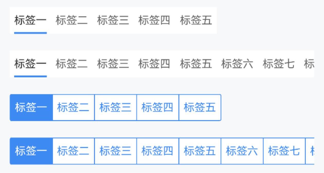
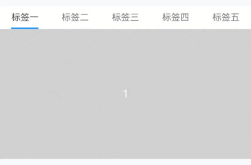
基本用法

点我查看代码
ts
@Entry
@ComponentV2
struct DemoPage {
  @Local tabsList: IBestTabItemType[] = []
  @Local curTabName: string = "1"
  aboutToAppear() {
    setTimeout(() => {
      this.tabsList = [
        {
          label: "标签一",
          name: "1"
        },
        {
          label: "标签二",
          name: "2"
        },
        {
          label: "标签三",
          name: "3"
        },
        {
          label: "标签四",
          name: "4"
        },
        {
          label: "标签五",
          name: "5"
        }
      ]
    }, 1000)
  }
  build() {
    Column(){
      IBestTabs({
        tabsList: this.tabsList,
        currentName: this.curTabName!!
      })
    }
  }
}
样式风格

点我查看代码
ts
@Entry
@ComponentV2
struct DemoPage {
  @Local tabsList: IBestTabItemType[] = [
    {
      label: "标签一",
      name: "1"
    },
    {
      label: "标签二",
      name: "2"
    },
    {
      label: "标签三",
      name: "3"
    },
    {
      label: "标签四",
      name: "4"
    },
    {
      label: "标签五",
      name: "5"
    }
  ]
  @Local curTabName: string = "1"
  build() {
    Column(){
      IBestTabs({
        tabsList: this.tabsList,
        type: "card",
        currentName: this.curTabName!!
      })
    }
  }
}
收缩布局
TIP
通过 tabWidthType 属性可设置单个tab的宽度类型。
点我查看代码
ts
@Entry
@ComponentV2
struct DemoPage {
  @Local tabsList: IBestTabItemType[] = [
    {
      label: "标签一",
      name: "1"
    },
    {
      label: "标签二",
      name: "2"
    },
    {
      label: "标签三",
      name: "3"
    },
    {
      label: "标签四",
      name: "4"
    },
    {
      label: "标签五",
      name: "5"
    }
  ]
  @Local tabsList1: IBestTabItem[] = [
    new IBestTabItem({
      label: "标签一",
      name: "1"
    }),
    new IBestTabItem({
      label: "标签二",
      name: "2"
    }),
    new IBestTabItem({
      label: "标签三",
      name: "3"
    }),
    new IBestTabItem({
      label: "标签四",
      name: "4"
    }),
    new IBestTabItem({
      label: "标签五",
      name: "5"
    }),
    new IBestTabItem({
      label: "标签六",
      name: "6"
    }),
    new IBestTabItem({
      label: "标签七",
      name: "7"
    }),
    new IBestTabItem({
      label: "标签八",
      name: "8"
    }),
    new IBestTabItem({
      label: "标签九",
      name: "9"
    }),
    new IBestTabItem({
      label: "标签十",
      name: "10"
    })
  ]
  @Local curTabName: string = "1"
  @Local curTabName1: string = "1"
  build() {
    Column({space: 20}){
      IBestTabs({
        tabHeight: 60,
        tabWidthType: "auto",
        tabsList: this.tabsList,
        currentName: this.curTabName!!
      })
      IBestTabs({
        tabHeight: 60,
        tabWidthType: "auto",
        tabsList: this.tabsList1,
        currentName: this.curTabName!!
      })
      IBestTabs({
        tabHeight: 60,
        tabWidthType: "auto",
        type: "card",
        tabsList: this.tabsList,
        currentName: this.curTabName1!!
      })
      IBestTabs({
        tabHeight: 60,
        tabWidthType: "auto",
        type: "card",
        tabsList: this.tabsList1,
        currentName: this.curTabName1!!
      })
    }
    .alignItems(HorizontalAlign.Start)
  }
}
固定线宽

TIP
通过 isTabLineWidthFixed 属性可设置标记线宽是否固定,通过lineOffsetY属性设置标记线偏移量。
点我查看代码
ts
@Entry
@ComponentV2
struct DemoPage {
@Local tabsList: IBestTabItemType[] = [
{
label: "标签一",
name: "1"
},
{
label: "标签二",
name: "2"
},
{
label: "标签三",
name: "3"
},
{
label: "标签四",
name: "4"
},
{
label: "标签五",
name: "5"
}
]
@Local curTabName: string = "1"
build() {
Column(){
IBestTabs({
tabsList: this.tabsList,
tabHeight: 80,
isTabLineWidthFixed: true,
tabLineWidth: 30,
lineOffsetY: 10,
currentName: this.curTabName!!
})
}
}
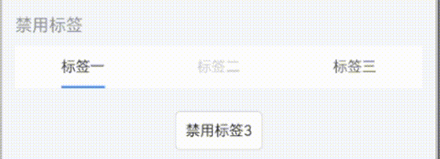
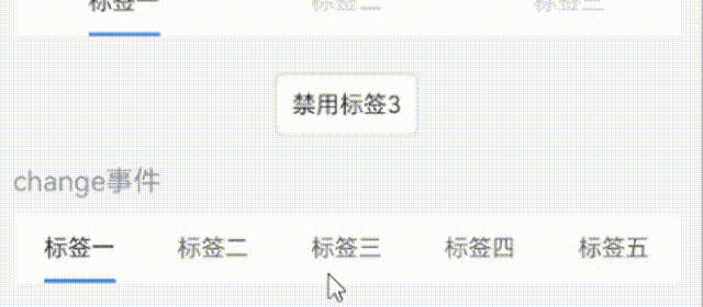
}禁用标签
TIP
如需动态修改标签内容, 请使用 IBestTabItem 实例, 通过列表项中 isDisable 属性可设置单项是否禁用。
点我查看代码
ts
import { IBestButton } from '@ibestservices/ibest-ui'
@Entry
@ComponentV2
struct DemoPage {
@Local tabsList: IBestTabItem[] = [
new IBestTabItem({
label: "标签一",
name: "1"
}),
new IBestTabItem({
label: "标签二",
name: "2",
isDisable: true
}),
new IBestTabItem({
label: "标签三",
name: "3"
})
]
@Local curTabName: string = "1"
build() {
Column({space: 20}){
IBestTabs({
tabsList: this.tabsList,
currentName: this.curTabName!!
})
IBestButton({
text: "禁用标签3",
buttonSize: "small",
onBtnClick: () => {
this.tabsList[2].isDisable = !this.tabsList[2].isDisable
}
})
}
}
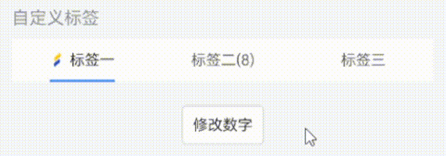
}自定义标签内容
TIP
通过 列表项中 icon 属性可添加图片,通过 列表项中 number 属性可添加数字。
点我查看代码
ts
import { IBestButton } from '@ibestservices/ibest-ui'
@Entry
@ComponentV2
struct DemoPage {
  @Local tabsList: IBestTabItem[] = [
    new IBestTabItem({
      label: "标签一",
      name: "1",
      icon: "https://ibestui.ibestservices.com/favicon.ico"
    }),
    new IBestTabItem({
      label: "标签二",
      name: "2",
      number: 1
    }),
    new IBestTabItem({
      label: "标签三",
      name: "3"
    })
  ]
  @Local curTabName: string = "1"
  build() {
    Column({space: 20}){
      IBestTabs({
        tabsList: this.tabsList,
        currentName: this.curTabName!!
      })
      IBestButton({
        text: "修改数字",
        buttonSize: "small",
        onBtnClick: () => {
          if(this.tabsList[1].number != undefined){
            this.tabsList[1].number += 1
          }
        }
      })
    }
  }
}
onChange事件
点我查看代码
ts
import { IBestToast } from '@ibestservices/ibest-ui'
@Entry
@ComponentV2
struct DemoPage {
  @Local tabsList: IBestTabItemType[] = [
    {
      label: "标签一",
      name: "1"
    },
    {
      label: "标签二",
      name: "2"
    },
    {
      label: "标签三",
      name: "3"
    },
    {
      label: "标签四",
      name: "4"
    },
    {
      label: "标签五",
      name: "5"
    }
  ]
  @Local curTabName: string = "1"
  build() {
    Column(){
      IBestTabs({
        tabsList: this.tabsList,
        currentName: this.curTabName!!,
        onChange: name => {
          IBestToast.show("当前点击的是:" + name)
        }
      })
    }
  }
}
内容联动
点我查看代码
ts
@Entry
@ComponentV2
struct DemoPage {
  @Local tabsList: IBestTabItemType[] = [
    {
      label: "标签一",
      name: "1"
    },
    {
      label: "标签二",
      name: "2"
    },
    {
      label: "标签三",
      name: "3"
    },
    {
      label: "标签四",
      name: "4"
    },
    {
      label: "标签五",
      name: "5"
    }
  ]
  @Local curTabName: string = "1"
  @Builder tabContent(){
    ForEach([1,2,3,4,5], (item: number) => {
      Row(){
        Text(item.toString())
          .fontColor("#fff")
      }
      .width("100%")
      .height(200)
      .justifyContent(FlexAlign.Center)
      .backgroundColor("#ccc")
    })
  }
  build() {
    Column(){
      IBestTabs({
        tabsList: this.tabsList,
        currentName: this.curTabName!!
      }){
        this.tabContent()
      }
    }
  }
}
API
@Props
| 参数 | 说明 | 类型 | 默认值 |
|---|---|---|---|
| currentName | 当前选中标签的标识符, 支持双向绑定 | string | number | '' |
| type | 样式类型,可选值为 line card | string | line |
| tabHeight | 默认高度 | string | number | 35 |
| tabWidthType | tab宽度类型,可选值为 auto flex | string | flex |
| tabsList | 展示的tab列表 | (IBestTabItemType | IBestTabItem)[] | [] |
| tabPadding | 单个tab内边距 | string | number | 5 |
| isTabLineWidthFixed | 标记线宽度是否固定 | boolean | false |
| tabLineWidth | 标记线宽度,默认为tab内容宽度 | string | number | 0 |
| tabLineHeight | 标记线高度 | string | number | 2 |
| inactiveTextColor | 未激活的tab文字颜色 | ResourceColor | #666 |
| activeTextColor | 激活的tab文字颜色 | ResourceColor | #333 |
| tabLineColor | type 为 line 时, 为标记线颜色, type 为 card 时, 为标记块背景色 | ResourceColor | #3D8AF2 |
| lineOffsetY | 标记线Y方向偏移量 | string | number | 0 |
| tabBgColor | tab区域背景颜色 | ResourceColor | #fff |
| fontSize | tab文字大小 | string | number | 14 |
| isShowActiveBg | 是否显示激活背景, 仅type为line时有效 | boolean | false |
| activeBgColor | 激活背景色, 仅type为line时有效 | ResourceColor | '' |
| inactiveBgColor | 非激活背景色, 仅type为line时有效 | ResourceColor | '' |
| radius | 选项圆角, 仅type为line时有效 | Length | BorderRadiuses | LocalizedBorderRadiuses | 0 |
| showActiveLine | 是否显示激活标记线, 仅type为line时有效 | boolean | true |
| tabLineRadius | 标记线圆角, 仅type为line时有效 | string | number | 0 |
| activeFontWeight | 激活文字字重 | FontWeight | Normal |
| activeFontSize | 激活文字大小 | string | number | 14 |
| outerRadius | 外侧圆角 | Length | BorderRadiuses | LocalizedBorderRadiuses | 0 |
IBestTabItem IBestTabItemType 数据结构
| 参数 | 说明 | 类型 | 默认值 |
|---|---|---|---|
| label | tab文字内容(必填) | ResourceStr | - |
| name | tab匹配的标识符(必填) | string | number | - |
| number | 自定义显示数量 | number | - |
| icon | 自定义显示图片 | ResourceStr | - |
| isDisable | 控制是否禁用 | boolean | false |
| iconPosition | 图片位置, 可选值为 left right | string | left |
插槽
| 插槽名 | 说明 | 类型 |
|---|---|---|
| tabContentBuilder | 自定义tab内容 | CustomBuilder |
Events
| 事件名 | 说明 | 事件类型 |
|---|---|---|
| onChange | tab切换后的回调 | (name: string | number) => void |
| onTabClick | 点击tab后的回调 | (name: string | number) => void |
主题定制
组件提供了下列颜色变量,可用于自定义深色/浅色模式样式,使用方法请参考 颜色模式 章节,如需要其它颜色变量可提 issue。
| 名称 | 描述 | 默认值 |
|---|---|---|
| ibest_tab_background | 背景色 | #fff |
| ibest_tab_inactive_text_color | 未激活的tab文字颜色 | #646566 |
| ibest_tab_active_text_color | 激活的tab文字颜色 | #323233 |