Segmented 分段控制器
介绍
用于展示多个选项并允许用户选择其中单个选项。
TIP
阅读该组件文档前请确保已认真阅读快速上手章节的每一个字。
引入
ts
import { IBestSegmented, IBestSegmentedOption } from "@ibestservices/ibest-ui-v2";代码演示
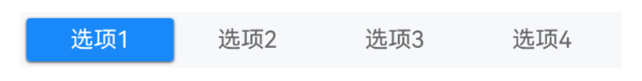
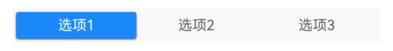
基础用法
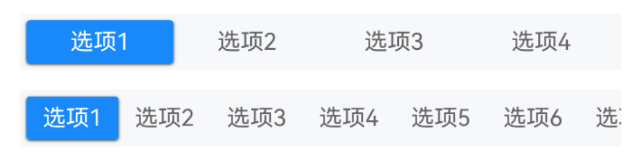
TIP
通过 widthType 属性可设置单个选项的宽度类型。
点我查看代码
ts
@Entry
@ComponentV2
struct DemoPage {
@Local value: string = "选项1"
@Local options: string[] = []
@Local value1: string = "选项1"
@Local longOptions: string[] = ['选项1', '选项2', '选项3', '选项4', '选项5', '选项6', '选项7', '选项8', '选项9', '选项10']
aboutToAppear() {
setTimeout(() => {
this.options = ['选项1', '选项2', '选项3', '选项4']
}, 1000)
}
build() {
Column({space: 14}){
IBestSegmented({
value: this.value!!,
options: this.options
})
IBestSegmented({
value: this.value1!!,
options: this.longOptions,
widthType: 'auto'
})
}.alignItems(HorizontalAlign.Start)
}
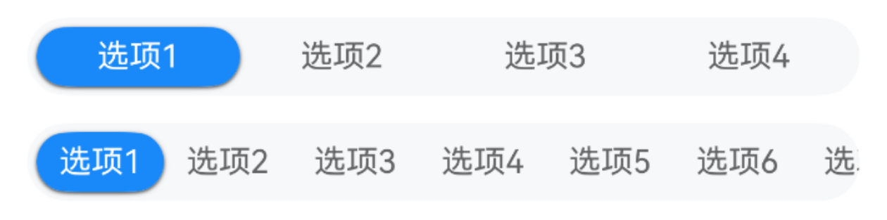
}胶囊形状
点我查看代码
ts
@Entry
@ComponentV2
struct DemoPage {
@Local value: string = "选项1"
@Local options: string[] = ['选项1', '选项2', '选项3', '选项4']
@Local value1: string = "选项1"
@Local longOptions: string[] = ['选项1', '选项2', '选项3', '选项4', '选项5', '选项6', '选项7', '选项8', '选项9', '选项10']
build() {
Column({space: 14}){
IBestSegmented({
value: this.value!!,
options: this.options,
round: true
})
IBestSegmented({
value: this.value1!!,
options: this.longOptions,
widthType: 'auto',
round: true
})
}.alignItems(HorizontalAlign.Start)
}
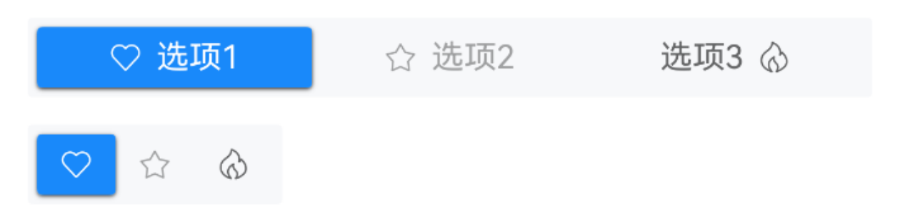
}自定义数据
点我查看代码
ts
@Entry
@ComponentV2
struct DemoPage {
@Local value: string = "1"
@Local options: IBestSegmentedOption[] = [
{ label: "选项1", value: "1", icon: "like-o" },
{ label: "选项2", value: "2", icon: "star-o", disabled: true },
{ label: "选项3", value: "3", icon: "fire-o", iconPosition: "right" }
]
@Local options1: IBestSegmentedOption[] = [
{ value: "1", icon: "like-o" },
{ value: "2", icon: "star-o", disabled: true },
{ value: "3", icon: "fire-o" }
]
build() {
Column({space: 14}){
IBestSegmented({
value: this.value!!,
options: this.options
})
IBestSegmented({
value: this.value!!,
options: this.options1,
widthType: 'auto'
})
}.alignItems(HorizontalAlign.Start)
}
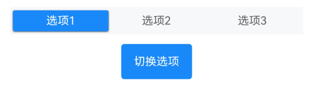
}动态选项
点我查看代码
ts
@Entry
@ComponentV2
struct DemoPage {
  @Local value: string = "选项1"
  @Local options: string[] = ['选项1', '选项2', '选项3', '选项4']
  build() {
    Column({space: 14}){
      IBestSegmented({
        value: this.value!!,
        options: this.options
      })
      IBestButton({
        type: 'primary',
        text: "切换选项",
        onBtnClick: () => {
          this.options = this.options.length == 3 ? ['选项1', '选项2', '选项3', '选项4'] : ['选项1', '选项2', '选项3']
        }
      })
    }.alignItems(HorizontalAlign.Start)
  }
}
事件监听
点我查看代码
ts
@Entry
@ComponentV2
struct DemoPage {
  @Local value: string = "选项1"
  @Local options: string[] = ['选项1', '选项2', '选项3', '选项4']
  build() {
    Column(){
      IBestSegmented({
        value: this.value!!,
        options: this.options,
        onChange: (value: string | number) => {
          IBestToast.show({
            message: `${value}`
          })
        }
      })
    }.alignItems(HorizontalAlign.Start)
  }
}
异步切换
点我查看代码
ts
@Entry
@ComponentV2
struct DemoPage {
  @Local value: string = '选项1'
  @Local options: string[] = ['选项1', '选项2', '选项3']
  build() {
    Column(){
      IBestSegmented({
        value: this.value!!,
        options: this.options,
        beforeChange: (value: string | number) => {
          return new Promise((resolve, reject) => {
            IBestDialogUtil.open({
              title: "提示",
              message: `点击选项为${value}, 确定要切换吗?`,
              showCancelButton: true,
              onConfirm: () => {
                resolve(true)
              },
              onCancel: () => {
                reject(false)
              }
            })
          })
        }
      })
    }.alignItems(HorizontalAlign.Start)
  }
}
API
@Props
| 参数 | 说明 | 类型 | 默认值 |
|---|---|---|---|
| value | 当前选中的值 | string | number | '' |
| options | 选项列表 | (string | number | IBestSegmentedOption | IBestSegmentedItem)[] | [] |
| widthType | 宽度类型, 可选 auto、flex | string | flex |
| contentHeight | 内容高度 | string | number | 34 |
| contentPadding | 内边距 | Length | Padding | LocalizedPadding | 4 |
| round | 是否为胶囊样式 | boolean | false |
| radius | 圆角大小, 仅round为false时生效 | Length | BorderRadiuses | LocalizedBorderRadiuses | 2 |
| itemPadding | 单个选项内边距 | Length | Padding | LocalizedPadding | {left: 10, right: 10} |
| bgColor | 背景颜色 | ResourceColor | #f7f8fa |
| activeBgColor | 选中项背景颜色 | ResourceColor | #1989fa |
| inactiveTextColor | 未选中项文字颜色 | ResourceColor | #646566 |
| activeTextColor | 选中项文字颜色 | ResourceColor | #fff |
| fontSize | 文字大小 | string | number | 14 |
| activeShadow | 色块阴影 | ShadowOptions | ShadowStyle | { radius: 4, color: "#333", offsetY: 2 } |
| beforeChange | 切换前回调 | (value: string | number) => boolean | Promise<boolean> | - |
IBestSegmentedItem IBestSegmentedOption 数据结构
| 参数 | 说明 | 类型 | 默认值 |
|---|---|---|---|
| label | 文字内容 | ResourceStr | - |
| value | 标识符(必填) | string | number | '' |
| icon | 图标 | ResourceStr | - |
| iconPosition | 图标位置, 可选值为 left right | string | left |
| disabled | 是否禁用 | boolean | false |
Events
| 事件名 | 说明 | 事件类型 |
|---|---|---|
| onOptionClick | 选项点击回调 | (value: string | number) => void |
| onChange | 切换回调 | (value: string | number) => void |
主题定制
组件提供了下列颜色变量,可用于自定义深色/浅色模式样式,使用方法请参考 颜色模式 章节,如需要其它颜色变量可提 issue。
| 名称 | 描述 | 默认值 |
|---|---|---|
| ibest_segmented_background | 背景颜色 | #f7f8fa |
| ibest_segmented_inactive_text_color | 未选中文字颜色 | #646566 |
| ibest_segmented_active_text_color | 选中文字颜色 | #fff |