Search 搜索
介绍
用于搜索场景的输入框组件。
TIP
阅读该组件文档前请确保已认真阅读快速上手章节的每一个字。
引入
ts
import { IBestSearch } from "@ibestservices/ibest-ui-v2";代码演示
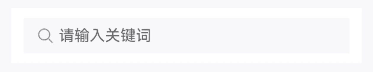
基础用法
TIP
通过 autoFocus 属性,可以设置搜索框自动获取焦点。
点我查看代码
ts
@Entry
@ComponentV2
struct DemoPage {
@Local value: string = ""
build() {
Column(){
IBestSearch({
value: this.value!!,
placeholder: "请输入关键词",
autoFocus: true
})
}
}
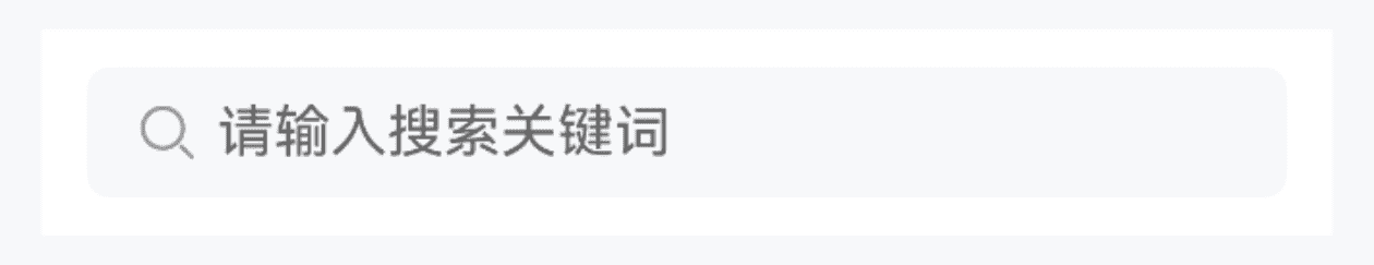
}圆角
点我查看代码
ts
@Entry
@ComponentV2
struct DemoPage {
  @Local value: string = ""
  build() {
    Column(){
      IBestSearch({
        value: this.value!!,
        placeholder: "请输入关键词",
        radius: 12
      })
    }
  }
}
禁用
点我查看代码
ts
@Entry
@ComponentV2
struct DemoPage {
@Local value: string = ""
build() {
Column(){
IBestSearch({
value: this.value!!,
placeholder: "请输入关键词",
disabled: true
})
}
}
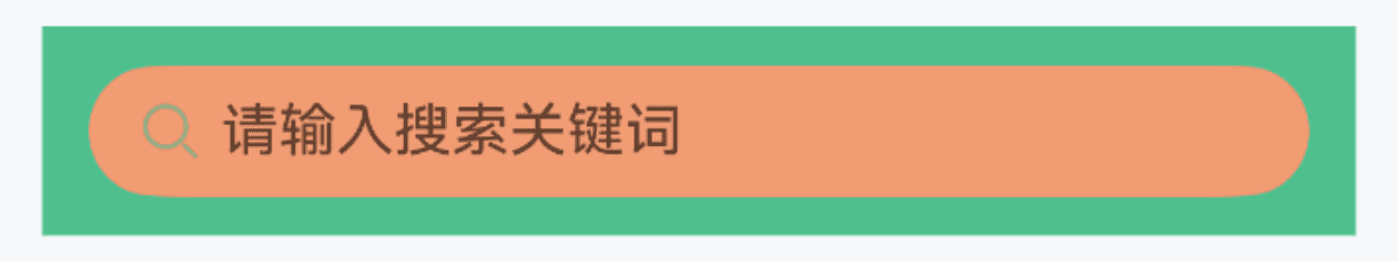
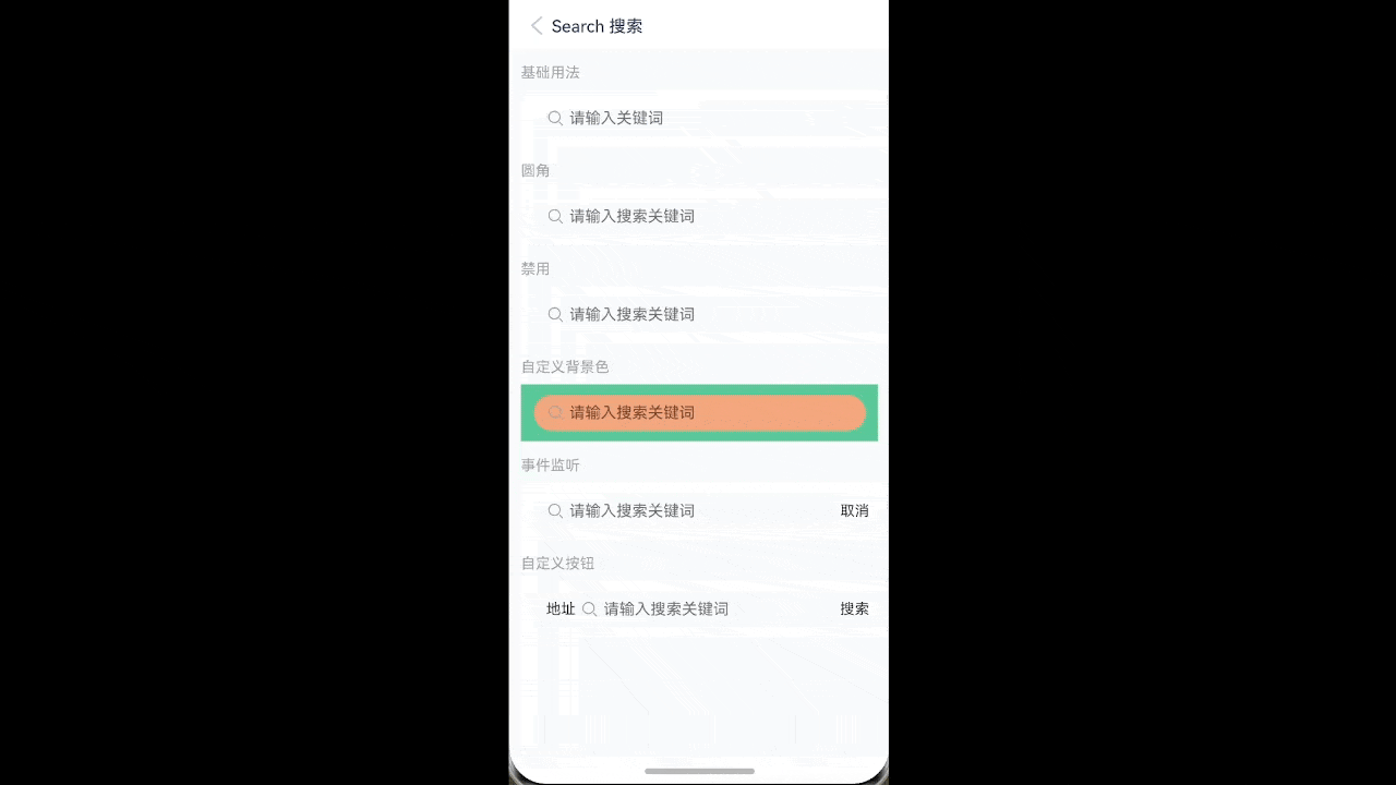
}自定义样式
点我查看代码
ts
@Entry
@ComponentV2
struct DemoPage {
  @Local value: string = ""
  build() {
    Column(){
      IBestSearch({
        value: this.value!!,
        placeholder: "请输入关键词",
        isRound: true,
        outBgColor: "#4fc08d",
        innerBgColor: "#F29C73"
      })
    }
  }
}
事件监听
点我查看代码
ts
import { IBestToast } from "@ibestservices/ibest-ui-v2";
@Entry
@ComponentV2
struct DemoPage {
  @Local value: string = ""
  build() {
    Column(){
      IBestSearch({
        value: this.value!!,
        placeholder: "请输入关键词",
        showRightButton: true,
        clearable: true,
        onRightButtonClick: () => {
          IBestToast.show("rightIconClick")
        },
        onClear: () => {
          IBestToast.show("clear")
        },
        onSearch: () => {
          IBestToast.show(`search: ${this.value}`)
        },
        onInput: (value: string) => {
          console.log(`输入的值为: ${value}`)
        }
      })
    }
  }
}
自定义按钮

TIP
通过 label 属性可设置左侧文本, 通过 rightButtonText 属性可设置右侧按钮文本, 通过 customRightButton 属性可自定义右侧按钮。
点我查看代码
ts
@Entry
@ComponentV2
struct DemoPage {
  @Local value: string = ""
  @Builder customBtn(){
    Text("自定义按钮")
      .height("100%")
      .padding({ left: 10, right: 10 })
      .backgroundColor("#eee")
  }
  build() {
    Column({ space: 20 }){
      IBestSearch({
        value: this.value!!,
        placeholder: "请输入关键词",
        label: "地址",
        showRightButton: true,
        rightButtonText: "搜索"
      })
      IBestSearch({
        value: this.value!!,
        label: "地址",
        customRightButton: (): void => this.customBtn()
      })
    }
  }
}
API
@Props
| 参数 | 说明 | 类型 | 默认值 |
|---|---|---|---|
| value | 当前输入的值, 支持双向绑定 | string | '' |
| label | 输入框左侧文本 | ResourceStr | '' |
| placeholder | 占位文字 | ResourceStr | '' |
| placeholderColor | 占位文字颜色 | ResourceColor | #c8c9cc |
| contentHeight | 搜索框高度 | string | number | 34 |
| outBgColor | 外侧背景色 | ResourceColor | #fff |
| innerBgColor | 内侧背景色 | ResourceColor | #f7f8fa |
| isRound | 是否为胶囊搜索框, 优先级大于 radius | boolean | false |
| radius | 圆角大小 | string | number | 0 |
| leftIcon | 左侧图标 | ResourceStr | - |
| leftIconColor | 左侧图标颜色 | ResourceColor | #969799 |
| clearable | 是否可清空 | boolean | true |
| clearIcon | 清除图标 | ResourceStr | - |
| clearTrigger | 清除图标显示时机, 可选值 always focus | string | focus |
| autoFocus | 是否自定聚焦 | boolean | false |
| showRightButton | 是否显示右侧按钮 | boolean | false |
| rightButtonText | 右侧按钮文本 | ResourceStr | 取消 |
| disabled | 是否禁用 | boolean | false |
| readOnly | 是否只读 | boolean | false |
| enterKeyType | 输入法回车键类型, 详见EnterKeyType枚举说明 | EnterKeyType | Search |
| customRightButton | 自定义右侧按钮 | CustomBuilder | - |
| textColor | 输入框文字颜色 | ResourceColor | #323233 |
| labelColor | 左侧文本颜色 | ResourceColor | #323233 |
| textFontSize | 输入框文字大小 | string | number | 14 |
| rightBtnBgColor | 右侧按钮背景色 | ResourceColor | #fff |
| rightBtnPressBgColor | 右侧按钮按压背景色 | ResourceColor | #f2f3f5 |
| outPadding | 外侧内边距 | Padding | Length | | |
| caretColor 1.1.2 | 光标颜色 | ResourceColor | '' |
Events
| 事件名 | 说明 | 事件类型 |
|---|---|---|
| onInput | 输入时触发 | (value: string) => void |
| onSearch | 点击输入法右下角按钮触发 | () => void |
| onInputBlur | 搜索框失焦时触发 | () => void |
| onInputFocus | 搜索框聚焦时触发 | () => void |
| onClear | 点击清除图标时触发 | () => void |
| onRightButtonClick | 点击右侧按钮时触发 | () => void |
主题定制
组件提供了下列颜色变量,可用于自定义深色/浅色模式样式,使用方法请参考 颜色模式 章节,如需要其它颜色变量可提 issue。
| 名称 | 描述 | 默认值 |
|---|---|---|
| ibest_search_outer_background | 外部背景色 | #fff |
| ibest_search_inner_background | 内部背景色 | #f7f8fa |
| ibest_search_label_color | 输入框左侧文本文字颜色 | #323233 |
| ibest_search_left_icon_color | 输入框左侧图标颜色 | #969799 |