Radio 单选框
介绍
在一组备选项中进行单选。
TIP
阅读该组件文档前请确保已认真阅读快速上手章节的每一个字。
引入
ts
import { IBestRadio, IBestRadioGroup } from "@ibestservices/ibest-ui-v2";代码演示
基础用法
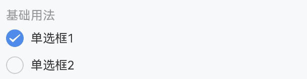
TIP
• 通过 group 属性绑定 IBestRadioGroup 与 IBestRadio 的关系, group 值需具有全局唯一性。
• IBestRadio 组件的 name 值在同一 group 中需具备唯一性。
点我查看代码
ts
@Entry
@ComponentV2
struct DemoPage {
@Local group: string = "group"
@Local active: string = "1"
build() {
Column(){
IBestRadioGroup({ group: this.group, active: this.active!! }){
IBestRadio({
group: this.group,
label: '单选框1',
name: '1'
})
IBestRadio({
group:this.group,
label: '单选框2',
name: '2'
})
}
}
}
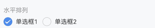
}水平排列
点我查看代码
ts
@Entry
@ComponentV2
struct DemoPage {
  @Local group: string = "group"
  @Local active: string = "1"
  build() {
    Column(){
      IBestRadioGroup({ group: this.group, active: this.active!!, placeDirection: Axis.Horizontal }){
        IBestRadio({
          group: this.group,
          label: '单选框1',
          name: '1'
        })
        IBestRadio({
          group:this.group,
          label: '单选框2',
          name: '2'
        })
      }
    }
  }
}
禁用状态
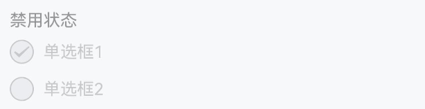
TIP
在 Radio 上设置 disabled 可以禁用单个选项。
点我查看代码
ts
@Entry
@ComponentV2
struct DemoPage {
  @Local group: string = "group"
  @Local active: string = "1"
  build() {
    Column(){
      IBestRadioGroup({ group: this.group, active: this.active!! }){
        IBestRadio({
          group: this.group,
          label: '单选框1',
          disabled: true,
          name: '1'
        })
        IBestRadio({
          group:this.group,
          label: '单选框2',
          name: '2'
        })
      }
    }
  }
}
自定义形状
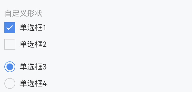
TIP
shape 属性可选值为 square 和 dot,单选框形状分别对应方形和圆点形。
点我查看代码
ts
@Entry
@ComponentV2
struct DemoPage {
  @Local group: string = "group"
  @Local active: string = "1"
  build() {
    Column(){
      IBestRadioGroup({ group: this.group, active: this.active!! }){
        IBestRadio({
          group: this.group,
          label: '单选框1',
          shape: 'square',
          name: '1'
        })
        IBestRadio({
          group:this.group,
          label: '单选框2',
          shape: 'dot',
          name: '2'
        })
      }
    }
  }
}
自定义颜色
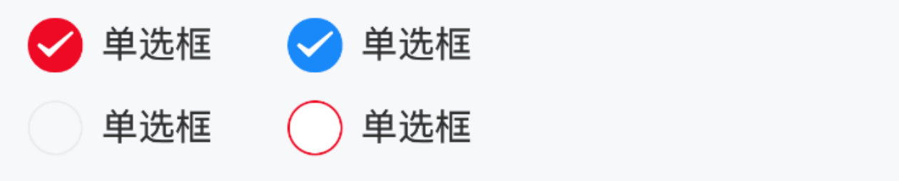
TIP
通过 checkedColor 属性设置选中状态的图标颜色。
点我查看代码
ts
@Entry
@ComponentV2
struct DemoPage {
  @Local group: string = "group"
  @Local active: string = "1"
  build() {
    Row({space: 14}){
      IBestRadioGroup({ group: this.group, active: this.active!! }){
        IBestRadio({
          group: this.group,
          label: '单选框',
          checkedColor: '#ee0a24',
          name: '1'
        })
        IBestRadio({
          group: this.group,
          label: '单选框',
          checkedColor: '#ee0a24',
          name: '2'
        })
      }
      IBestRadioGroup({ group: this.group, active: this.active!! }){
        IBestRadio({
          group: this.group,
          label: '单选框',
          bgColor: "#fff",
          bdColor: "#ee0a24",
          name: '1'
        })
        IBestRadio({
          group: this.group,
          label: '单选框',
          bgColor: "#fff",
          bdColor: "#ee0a24",
          name: '2'
        })
      }
    }
  }
}
自定义大小
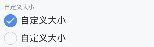
TIP
通过 iconSize 属性可以自定义图标和文字的大小。
点我查看代码
ts
@Entry
@ComponentV2
struct DemoPage {
  @Local group: string = "group"
  @Local active: string = "1"
  build() {
    Column(){
      IBestRadioGroup({ group: this.group, active: this.active!! }){
        IBestRadio({
          group: this.group,
          label: '自定义大小',
          iconSize: 30,
          name: '1'
        })
        IBestRadio({
          group: this.group,
          label: '自定义大小',
          iconSize: 30,
          name: '2'
        })
      }
    }
  }
}
左侧文本
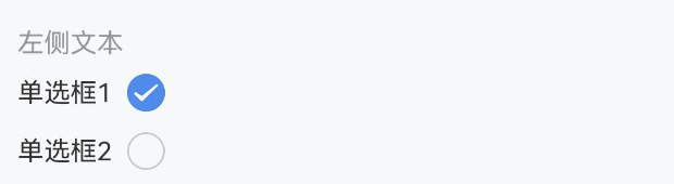
TIP
将 labelPosition 属性设置为 'left',可以将文本位置调整到单选框左侧。
点我查看代码
ts
@Entry
@ComponentV2
struct DemoPage {
  @Local group: string = "group"
  @Local active: string = "1"
  build() {
    Column(){
      IBestRadioGroup({ group: this.group, active: this.active!! }){
        IBestRadio({
          group: this.group,
          label: '单选框',
          labelPosition: 'left',
          name: '1'
        })
        IBestRadio({
          group: this.group,
          label: '单选框',
          labelPosition: 'left',
          name: '2'
        })
      }
    }
  }
}
禁用文本点击
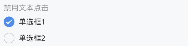
TIP
设置 labelDisabled 属性后,点击图标以外的内容不会触发单选框切换。
点我查看代码
ts
@Entry
@ComponentV2
struct DemoPage {
@Local group: string = "group"
@Local active: number = 1
build() {
Column(){
IBestRadioGroup({ group: this.group, active: this.active!! }){
IBestRadio({
group: this.group,
label: '单选框',
labelDisabled: true,
name: 1
})
IBestRadio({
group: this.group,
label: '单选框',
labelDisabled: true,
name: 2
})
}
}
}
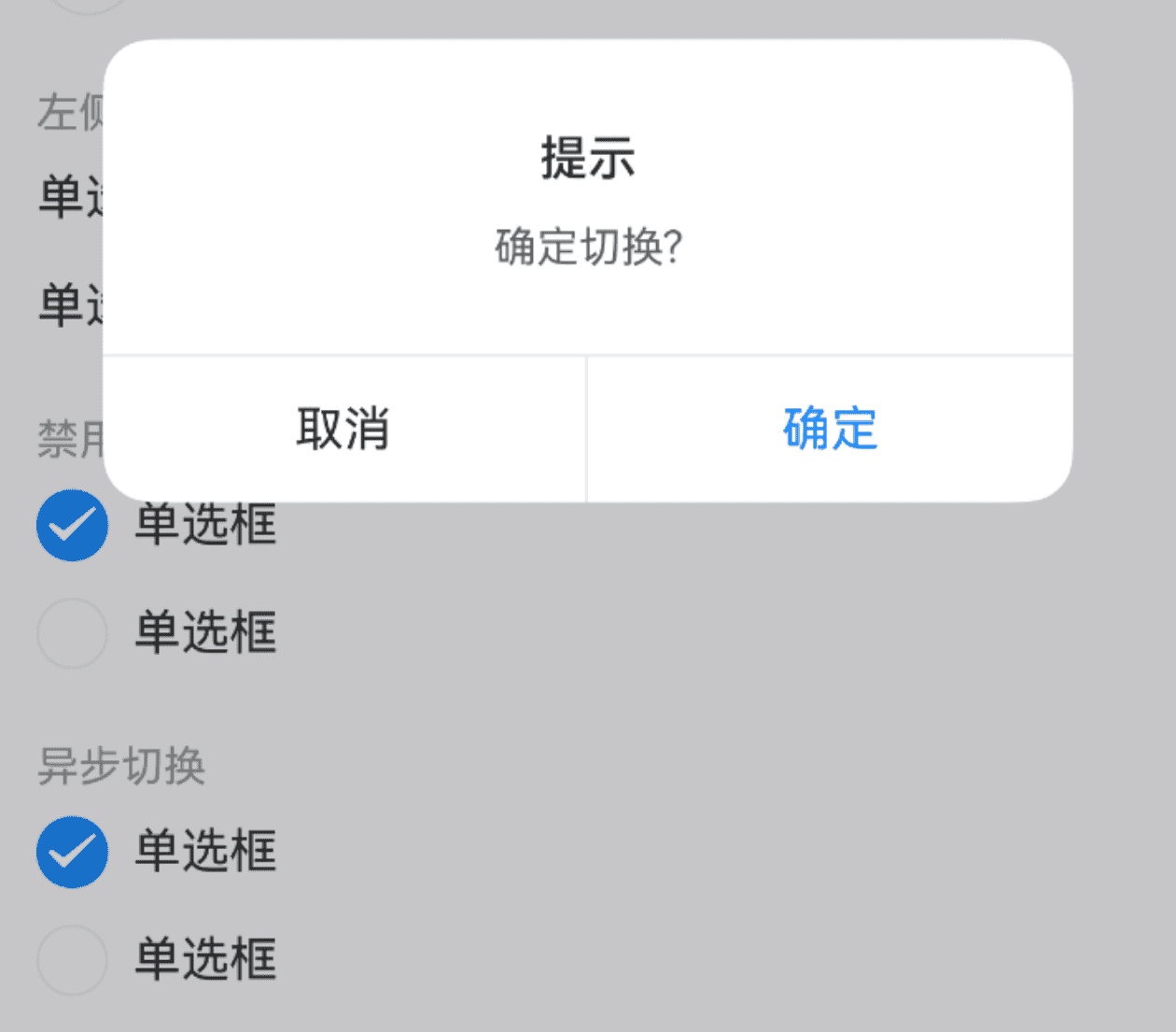
}异步切换
点我查看代码
ts
@Entry
@ComponentV2
struct DemoPage {
  @Local group: string = "group"
  @Local active: number = 1
  build() {
    Column(){
      IBestRadioGroup({ group: this.group, active: this.active!!, beforeChange: () => {
        return new Promise((resolve, reject) => {
          IBestDialogUtil.open({
            title: "提示",
            message: "确定切换?",
            showCancelButton: true,
            onConfirm: () => {
              resolve(true)
            },
            onCancel: () => {
              reject(false)
            }
          })
        })
      } }){
        IBestRadio({
          group: this.group,
          label: '单选框',
          name: 1
        })
        IBestRadio({
          group: this.group,
          label: '单选框',
          name: 2
        })
      }
    }
  }
}
搭配单元格组件使用
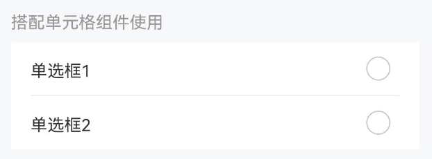
TIP
搭配单元格组件使用时,需要再引入 IBestCell 和 IBestCellGroup 组件。
点我查看代码
ts
import { IBestCell } from '@ibestservices/ibset-ui'
@Entry
@ComponentV2
struct DemoPage {
  @Local group: string = "group"
  @Local active: boolean = true
  @Builder CellRadio(name: boolean, group: string) {
    IBestRadio({ name, group })
  }
  build() {
    Column(){
      IBestRadioGroup({ group: this.group, active: this.active!! }){
        IBestCell({
          title: '是',
          rightIconBuilder: () => this.CellRadio(true, this.group),
          clickable: true,
          onCellClick: () => {
            this.active = true
          }
        })
        IBestCell({
          title: '否',
          rightIconBuilder: () => this.CellRadio(false, this.group),
          hasBorder: false,
          clickable: true,
          onCellClick: () => {
            this.active = false
          }
        })
      }
    }
  }
}
API
Radio @Props
| 参数 | 说明 | 类型 | 默认值 |
|---|---|---|---|
| group | 标识符,通常为一个唯一的字符串,需具备全局唯一性或已入栈的页面唯一性 | string | number | '' |
| name | 标识符,通常为一个唯一的字符串或数字 | string | number | boolean | '' |
| label | 显示的文本 | ResourceStr | '' |
| iconSize | 图标大小 | string | number | 18 |
| shape | 形状,可选值为 round square dot | string | round |
| disabled | 是否为禁用状态 | boolean | false |
| labelDisabled | 是否禁用文本内容点击 | boolean | false |
| labelPosition | 文本位置,可选值为 left | string | right |
| checkedColor | 选中状态颜色 | ResourceColor | #1989fa |
| labelFontSize | 文本字体大小 | string | number | 16 |
| bgColor | 默认背景色 | ResourceColor | '' |
| bdColor | 默认边框色 | ResourceColor | #ebedf0 |
Radio 插槽
| 插槽名 | 说明 | 类型 |
|---|---|---|
| defaultBuilder | label 的插槽,优先级大于 label 属性 | data: { checked: boolean, disabled: boolean } |
| iconBuilder | 自定义图标插槽,需要自己调整选中与未选中展示的 UI 内容 | data: { checked: boolean, disabled: boolean } |
RadioGroup @Props
| 参数 | 说明 | 类型 | 默认值 |
|---|---|---|---|
| group | 标识符,通常为一个唯一的字符串, 需保证全局唯一性 | string | number | '' |
| active | 激活的标识, 支持双向绑定 | string | number | boolean | '' |
| placeDirection | 排列方向 | Axis | Axis.Vertical |
| space | 间距 | string | number | 12 |
| beforeChange | 改变前的回调 | (value: boolean) => Promise<boolean> | boolean | - |
| disabled | 是否禁用 | boolean | false |
RadioGroup Events
| 事件名 | 说明 | 事件类型 |
|---|---|---|
| onChange | 选中状态改变的回调事件 | (name: string | number | boolean) => void |
RadioGroup 插槽
| 插槽名 | 说明 | 参数类型 |
|---|---|---|
| defaultBuilder | 默认内容插槽 | - |
主题定制
组件提供了下列颜色变量,可用于自定义深色/浅色模式样式,使用方法请参考 颜色模式 章节,如需要其它颜色变量可提 issue。
| 名称 | 描述 | 默认值 |
|---|---|---|
| ibest_radio_label_color | 标签文字颜色 | #323233 |
| ibest_radio_disabled_label_color | 禁用时标签文字颜色 | #c8c9cc |
| ibest_radio_disabled_icon_color | 禁用时图标颜色 | #c8c9cc |
| ibest_radio_border_color | 边框颜色 | #ebedf0 |