Popover 气泡弹出框
介绍
弹出式的气泡菜单。
TIP
阅读该组件文档前请确保已认真阅读快速上手章节的每一个字。
引入
ts
import { IBestPopover, IBestPopoverAction } from "@ibestservices/ibest-ui-v2";事例通用代码
ts
  @Local textValue: string = ""
  @Builder triggerBuilder(type: string, text?: string){
    if(type == "button"){
      IBestButton({
        type: "primary",
        text
      })
    }else if(type == "text"){
      Text(text)
    }else if(type == "img"){
      Image($r("app.media.app_icon")).width(30)
    }else if(type == "input"){
      TextInput({text: this.textValue, placeholder: text})
        .width("100%")
        .onChange((text: string) => {
          if(text){
            this.actions = text.split("").map(e => {
              let obj: IBestPopoverAction = {
                text: "选项" + e
              }
              return obj
            })
          }else{
            this.actions = [
              {
                text: '选项一'
              },
              {
                text: '选项二'
              },
              {
                text: '选项三'
              }
            ]
          }
        })
    }
  }
代码演示
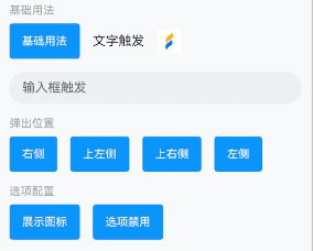
基础用法
点我查看代码
ts
@Entry
@ComponentV2
struct DemoPage {
@Local actions: IBestPopoverAction[] = [
{
text: '选项一'
},
{
text: '选项二'
},
{
text: '选项三'
},
{
text: '选项四'
}
]
build() {
Column({space: 16}){
Row({space: 16}){
IBestPopover({
actions: this.actions,
triggerBuilder: (): void => this.triggerBuilder("button", "基础用法"),
onSelect: (action: IBestPopoverAction, index: number) => {
IBestToast.show(action.text)
}
})
IBestPopover({
actions: this.actions,
triggerBuilder: (): void => this.triggerBuilder("text", "文字触发")
})
IBestPopover({
actions: this.actions,
triggerBuilder: (): void => this.triggerBuilder("img")
})
}
IBestPopover({
actions: this.actions,
popoverWidth: "100%",
triggerBuilder: (): void => this.triggerBuilder("input", "输入框触发"),
onSelect: (action: IBestPopoverAction, index: number) => {
this.textValue = action.text
}
})
}.width("100%").alignItems(HorizontalAlign.Start)
}
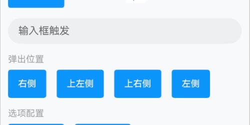
}弹出位置
点我查看代码
ts
@Entry
@ComponentV2
struct DemoPage {
@Local actions: IBestPopoverAction[] = [
{
text: '选项一'
},
{
text: '选项二'
}
]
build() {
Row({space: 16}){
IBestPopover({
actions: this.actions,
placement: Placement.Right,
triggerBuilder: (): void => this.triggerBuilder("button", "右侧")
})
IBestPopover({
actions: this.actions,
placement: Placement.TopLeft,
triggerBuilder: (): void => this.triggerBuilder("button", "上左侧")
})
IBestPopover({
actions: this.actions,
placement: Placement.TopRight,
triggerBuilder: (): void => this.triggerBuilder("button", "上右侧")
})
IBestPopover({
actions: this.actions,
placement: Placement.Left,
triggerBuilder: (): void => this.triggerBuilder("button", "左侧")
})
}
}
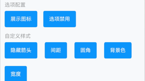
}选项配置
点我查看代码
ts
@Entry
@ComponentV2
struct DemoPage {
@Local actions: IBestPopoverAction[] = [
{
text: '选项一',
icon: 'add-o'
},
{
text: '选项二',
icon: 'music-o'
},
{
text: '选项三',
icon: $r("app.media.app_icon")
}
]
@Local actions1: IBestPopoverAction[] = [
{
text: '选项一',
disabled: true
},
{
text: '选项二',
disabled: true
},
{
text: '选项三'
}
]
build() {
Row({space: 16}){
IBestPopover({
actions: this.actions,
triggerBuilder: (): void => this.triggerBuilder("button", "展示图标")
})
IBestPopover({
actions: this.actions1,
triggerBuilder: (): void => this.triggerBuilder("button", "选项禁用")
})
}
}
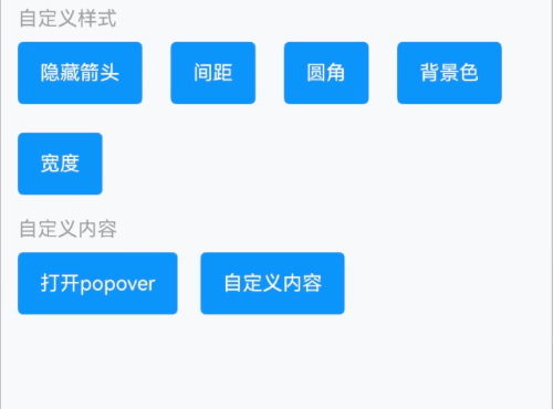
}自定义样式
点我查看代码
ts
@Entry
@ComponentV2
struct DemoPage {
@Local actions: IBestPopoverAction[] = [
{
text: '选项一'
},
{
text: '选项二'
},
{
text: '选项三'
},
{
text: '选项四'
}
]
build() {
Flex({wrap: FlexWrap.Wrap, space: { main: LengthMetrics.vp(20), cross: LengthMetrics.vp(20)}}){
IBestPopover({
actions: this.actions,
showArrow: false,
triggerBuilder: (): void => this.triggerBuilder("button", "隐藏箭头")
})
IBestPopover({
actions: this.actions,
space: 12,
triggerBuilder: (): void => this.triggerBuilder("button", "间距")
})
IBestPopover({
actions: this.actions,
radius: 16,
triggerBuilder: (): void => this.triggerBuilder("button", "圆角")
})
IBestPopover({
actions: this.actions,
bgColor: '#4a4a4a',
textColor: '#fff',
dividerColor: "#646566",
triggerBuilder: (): void => this.triggerBuilder("button", "背景色")
})
IBestPopover({
actions: this.actions,
popoverWidth: 200,
triggerBuilder: (): void => this.triggerBuilder("button", "宽度")
})
}
}
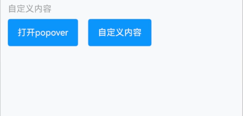
}自定义内容
点我查看代码
ts
import { IBestPopoverController } from "@ibestservices/ibest-ui-v2";
@Entry
@ComponentV2
struct DemoPage {
  private controller: IBestPopoverController = new IBestPopoverController()
  @Builder popoverContent(){
    Column({space: 14}){
      Row({space: 14}){
        Image($r("app.media.app_icon")).width(18)
        Text("自定义提示内容")
      }
      IBestButton({
        type: "primary",
        buttonSize: "small",
        text: "确定",
        onBtnClick: () => {
          this.controller.close()
        }
      })
    }
    .alignItems(HorizontalAlign.End)
    .padding(16)
  }
  build() {
    Row({space: 16}){
      IBestButton({
        type: "primary",
        text: "打开popover",
        onBtnClick: () => {
          this.controller.open()
        }
      })
      IBestPopover({
        controller: this.controller,
        actions: this.actions,
        triggerBuilder: (): void => this.triggerBuilder("button", "自定义内容"),
        popoverContentBuilder: (): void => this.popoverContent()
      })
    }
  }
}
API
@Props
| 参数 | 说明 | 类型 | 默认值 |
|---|---|---|---|
| actions | 通知栏文本内容 | IBestPopoverAction[] | [] |
| textFontSize | 选项文字大小 | string | number | 16 |
| textColor | 文字颜色 | ResourceColor | #323232 |
| itemHeight | 选项高度 | string | number | 44 |
| itemPadding | 左右内边距 | string | number | 16 |
| textAlign | 文字对齐方式 | TextAlign | - |
| iconSize | 左侧图标大小 | string | number | 20 |
| iconColor | 左侧图标颜色 | ResourceColor | #323232 |
| dividerColor | 分割线颜色 | ResourceColor | #ebedf0 |
| placement | 弹出位置 | Placement | Bottom |
| popoverWidth | 气泡框宽度 | string | number | '' |
| bgColor | 气泡框背景色 | ResourceColor | #fff |
| showArrow | 是否显示箭头 | boolean | true |
| arrowWidth | 箭头宽度 | string | number | 12 |
| arrowHeight | 箭头高度 | string | number | 6 |
| popoverMask | 设置气泡是否有遮罩层及遮罩颜色。如果设置为false,则没有遮罩层;如果设置为true,则设置有遮罩层并且颜色为透明色;如果设置为Color,则为遮罩层的颜色。 | boolean | IBestPopoverMask | true |
| space | 气泡与目标的间隙 | string | number | 4 |
| radius | 气泡圆角 | string | number | 8 |
| popoverShadow | 气泡阴影 | ShadowOptions | ShadowStyle | ShadowStyle.OUTER_DEFAULT_MD |
| borderSizeType | 底部分割线尺寸类型, 可选值 full center right | BorderSizeType | center |
| fixHeight | 内容高度 | string | number | auto |
| maxHeight | 内容最大高度 | string | number | auto |
| scrollBarState | 滚动条状态 | BarState | Auto |
IBestPopoverMask 数据类型
| 属性名 | 说明 | 类型 | 默认值 |
|---|---|---|---|
| color | 蒙层颜色值 | ResourceColor | - |
Events
| 事件名 | 说明 | 事件类型 |
|---|---|---|
| onSelect | 点击选项时回调 | (action: IBestPopoverAction, index: number) => void |
| onOpen | 气泡打开时回调 | () => void |
插槽
| 插槽名 | 说明 | 类型 |
|---|---|---|
| triggerBuilder | 触发气泡的对象 | CustomBuilder |
| popoverContentBuilder | 自定义popover内容 | CustomBuilder |
IBestPopoverAction 数据结构
| 属性名 | 说明 | 类型 | 默认值 |
|---|---|---|---|
| text | 选项文字 | string | '' |
| icon | 自定义文字左侧图标 | ResourceStr | '' |
| color | 左侧图标颜色 | ResourceColor | '' |
| disabled | 是否禁用 | boolean | '' |
| value | 选项标识 | string | '' |
IBestPopoverController 实例
| 方法名 | 说明 | 参数类型 | 返回值 |
|---|---|---|---|
| open | 打开气泡 | - | void |
| close | 关闭气泡 | - | void |
主题定制
组件提供了下列颜色变量,可用于自定义深色/浅色模式样式,使用方法请参考 颜色模式 章节,如需要其它颜色变量可提 issue。
| 名称 | 描述 | 默认值 |
|---|---|---|
| ibest_popover_background | 气泡框背景色 | #fff |
| ibest_popover_border_color | 气泡框边框颜色 | #ebedf0 |