PasswordInput 密码输入框
介绍
带网格的输入框组件,可以用于输入密码、短信验证码等场景,通常与数字键盘组件配合使用。
TIP
阅读该组件文档前请确保已认真阅读快速上手章节的每一个字。
引入
ts
import { IBestPasswordInput } from "@ibestservices/ibest-ui-v2";代码演示
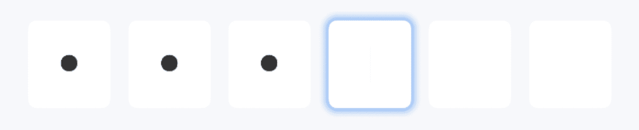
基础用法

TIP
通过设置 useSystemKeyboard 属性为 true , 可使用系统键盘。
点我查看代码
ts
@Entry
@ComponentV2
struct DemoPage {
  @Local value: string = '123'
  build() {
    Column(){
      IBestPasswordInput({
        value: this.value!!,
        numberKeyboardConfig:{
          extraKey: ".",
          styleType: "custom"
        }
      })
    }
  }
}
自定义长度

点我查看代码
ts
@Entry
@ComponentV2
struct DemoPage {
  @Local value: string = '123'
  build() {
    Column(){
      IBestPasswordInput({
        value: this.value!!,
        inputLength: 4
      })
    }
  }
}
格子间距
TIP
通过 space 属性可以设置格子间距, 以下属性仅在space不为0时生效:
• radius 设置单个格子圆角;
• isHighlightCurrent 设置是否高亮当前正在输入的格子;
• highlightColor 设置高亮颜色。
点我查看代码
ts
@Entry
@ComponentV2
struct DemoPage {
  @Local value: string = '123'
  build() {
    Column(){
      IBestPasswordInput({
        value: this.value!!,
        space: 20
      })
    }
  }
}
明文展示

点我查看代码
ts
@Entry
@ComponentV2
struct DemoPage {
@Local value: string = '123'
build() {
Column(){
IBestPasswordInput({
value: this.value!!,
isHidden: false
})
}
}
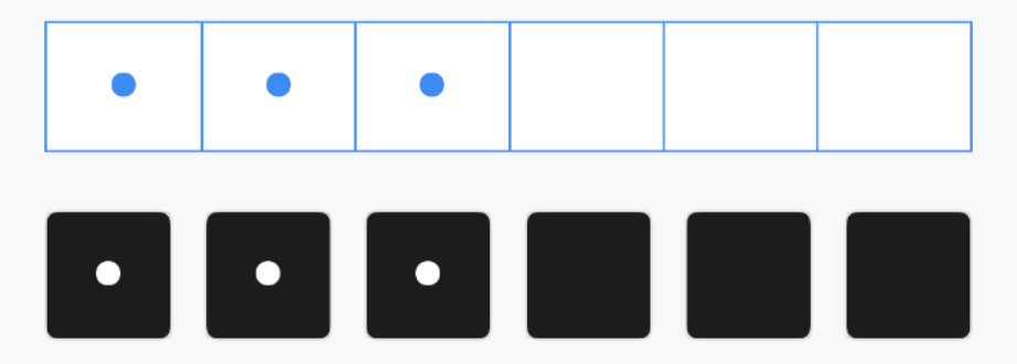
}自定义样式
点我查看代码
ts
@Entry
@ComponentV2
struct DemoPage {
@Local value: string = '123'
build() {
Column({space: 14}){
IBestPasswordInput({
value: this.value!!,
bdColor: '#3d8af2',
cellTextColor: '#3d8af2'
})
IBestPasswordInput({
value: this.value!!,
space: 12,
cellBgColor: "#1c1c1e",
cellTextColor: "#fff"
})
}
}
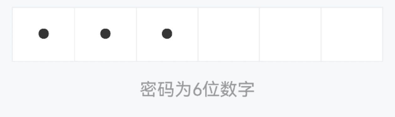
}提示信息
点我查看代码
ts
@Entry
@ComponentV2
struct DemoPage {
  @Local value: string = '123'
  @Local errorTip: string = ''
  @Monitor("value")
  valueChange(){
    if (this.value.length === 6 && this.value !== '123456') {
      this.errorTip = '密码错误'
    } else {
      this.errorTip = ''
    }
  }
  build() {
    Column(){
      IBestPasswordInput({
        value: this.value!!,
        tip: "密码为6位数字",
        errorTip: this.errorTip
      })
    }
  }
}
API
@Props
| 参数 | 说明 | 类型 | 默认值 |
|---|---|---|---|
| value | 当前输入框的值, 支持双向绑定 | string | '' |
| inputLength | 输入框长度 | number | 6 |
| inputHeight | 输入框高度 | string | number | 50 |
| space | 格子间距 | string | number | 0 |
| radius | 格子圆角,当 space 不为0时有效 | string | number | 5 |
| isHighlightCurrent | 是否高亮当前正在输入的格子,当 space 不为0时有效 | boolean | true |
| highlightColor | 格子高亮颜色,当 space 不为0时有效 | ResourceColor | #3D8AF2 |
| isHidden | 是否隐藏内容 | boolean | true |
| tip | 提示文字 | string | '' |
| errorTip | 错误提示文字 | string | '' |
| useSystemKeyboard | 是否使用系统键盘, 默认使用自定义键盘 | boolean | false |
| numberKeyboardConfig | 自定义键盘配置项 | NumberKeyboardConfig | - |
| isShowBorder | 是否显示边框线 | boolean | true |
| bdColor | 边框线颜色 | ResourceColor | #ebedf0 |
| cellBgColor | 格子背景色 | ResourceColor | #fff |
| cellTextColor | 格子文字颜色 | ResourceColor | #323233 |
| dotFontSize | 黑点大小 | string | number | 40 |
| textFontSize | 明文展示时文字大小 | string | number | 20 |
| tipFontSize | 提示文字大小 | string | number | 16 |
| autoFocus | 自动聚焦 | boolean | false |
| showCursor | 是否显示闪烁光标 | boolean | true |
| highlightType | 格子高亮类型, 可选值为 shadow border | string | border |
NumberKeyboardConfig 数据结构
| 参数 | 说明 | 类型 | 默认值 |
|---|---|---|---|
| title | 键盘标题 | string | '' |
| extraKey | 额外按键 | string | string[] | '' |
| closeBtnText | 关闭按钮文字 | string | 完成 |
| deleteButtonText | 删除按钮文字, 为空时显示图标 | string | '' |
| styleType | 样式风格, 可选值为 default custom | string | default |
| isRandomKeyOrder | 是否随机排序 | boolean | false |
Events
| 事件名 | 说明 | 事件类型 |
|---|---|---|
| onFieldClick | 点击输入框后触发 | () => void |
| onFinish | 输入完成后触发 | () => void |
主题定制
组件提供了下列颜色变量,可用于自定义深色/浅色模式样式,使用方法请参考 颜色模式 章节,如需要其它颜色变量可提 issue。
| 名称 | 描述 | 默认值 |
|---|---|---|
| ibest_password_input_background | 密码输入框背景色 | #fff |
| ibest_password_input_text_color | 密码输入框文字颜色 | #323233 |
| ibest_password_input_border_color | 密码输入框边框颜色 | #ebedf0 |