Cell 单元格
介绍
单元格为列表中的单个展示项。
TIP
阅读该组件文档前请确保已认真阅读快速上手章节的每一个字。
引入
ts
import { IBestCell, IBestCellGroup } from "@ibestservices/ibest-ui-v2";代码演示
基础用法
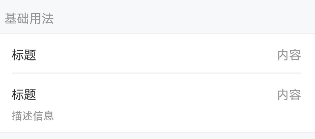
TIP
Cell 可以单独使用,也可以与 CellGroup, CellGroup 可以为 Cell 提供上下外边框。
点我查看代码
ts
@Entry
@ComponentV2
struct DemoPage {
build() {
IBestCellGroup() {
IBestCell({
title: '标题',
value: '内容'
})
IBestCell({
title: '标题',
value: '内容',
label: '描述信息',
hasBorder: false
})
}
}
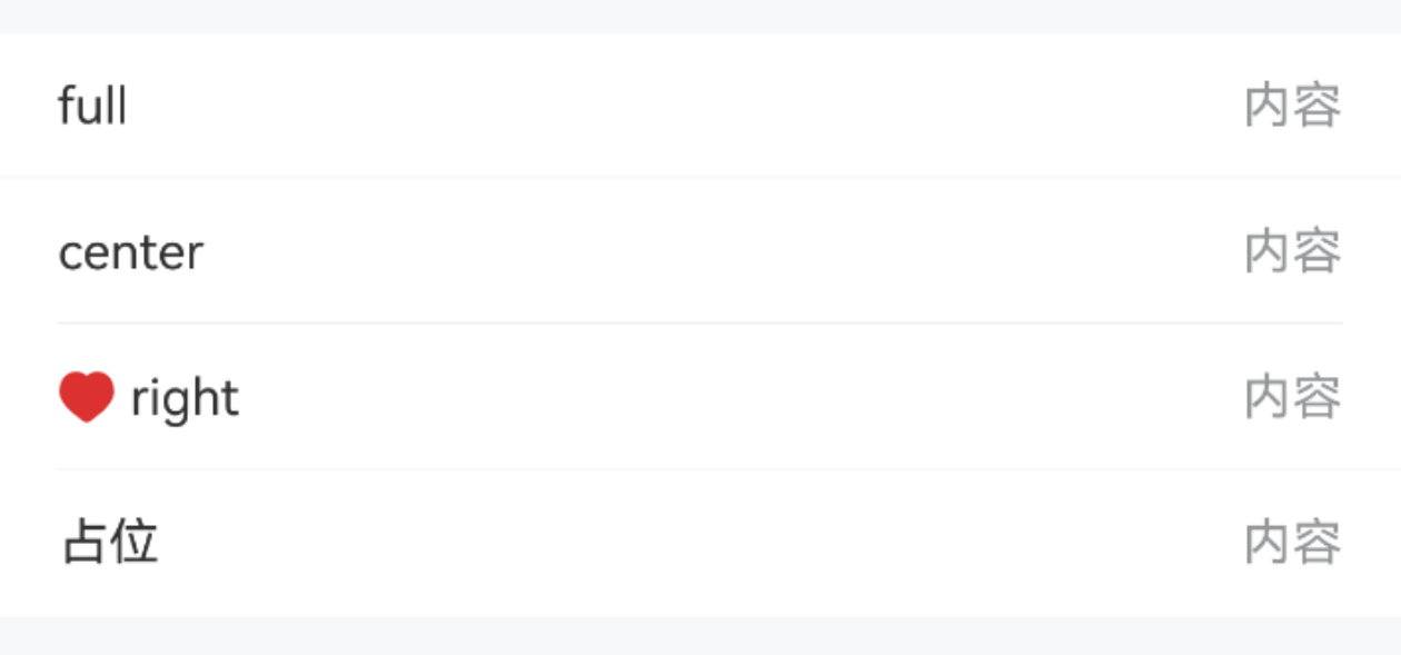
}下边框样式
点我查看代码
ts
@Entry
@ComponentV2
struct DemoPage {
  build() {
    Column(){
      IBestCellGroup() {
        IBestCell({ title: 'full', value: '内容', borderSizeType: 'full' })
        IBestCell({ title: 'center', value: '内容', borderSizeType: 'center' })
        IBestCell({
          leftIcon: $r("app.media.icon_like_o"),
          title: 'right',
          value: '内容',
          borderSizeType: 'right'
        })
        IBestCell({ title: '占位', value: '内容', hasBorder: false })
      }
    }
  }
}
卡片风格
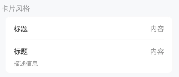
TIP
通过 CellGroup 的 inset 属性,可以将单元格转换为圆角卡片风格
点我查看代码
ts
@Entry
@ComponentV2
struct DemoPage {
  build() {
    Column(){
      IBestCellGroup({ inset: true }) {
        IBestCell({
          title: '标题',
          value: '内容'
        })
        IBestCell({
          title: '标题',
          value: '内容',
          label: '描述信息',
          hasBorder: false
        })
      }
    }
  }
}
分组标题
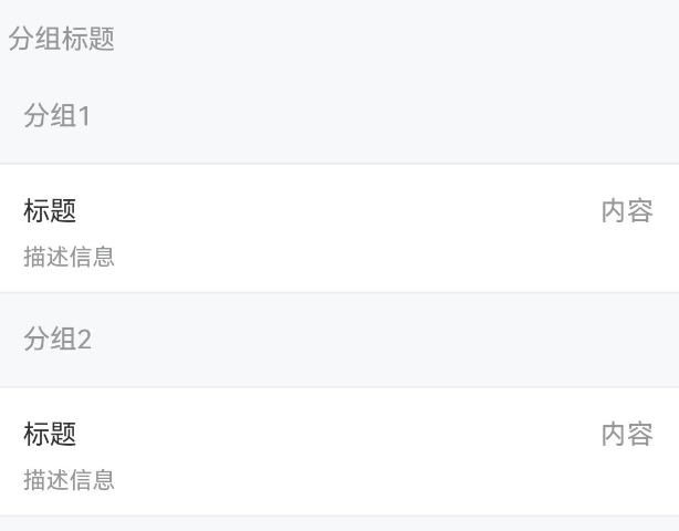
TIP
通过 CellGroup 的 title 属性可以指定分组标题。
点我查看代码
ts
@Entry
@ComponentV2
struct DemoPage {
  build() {
    Column(){
      IBestCellGroup({ title: '分组1' }) {
        IBestCell({
          title: '标题',
          value: '内容',
          label: '描述信息',
          hasBorder: false
        })
      }
      IBestCellGroup({ title: '分组2' }) {
        IBestCell({
          title: '标题',
          value: '内容',
          label: '描述信息',
          hasBorder: false
        })
      }
    }
  }
}
单元格大小
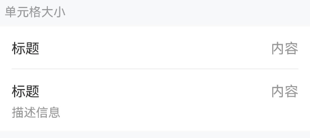
TIP
通过 cellSize 属性可以控制单元格的大小。
点我查看代码
ts
@Entry
@ComponentV2
struct DemoPage {
  build() {
    Column(){
      IBestCellGroup() {
        IBestCell({ title: '标题', value: '内容', cellSize: 'large' })
        IBestCell({
          title: '标题',
          value: '内容',
          label: '描述信息',
          hasBorder: false,
          cellSize: 'large'
        })
      }
    }
  }
}
展示图标
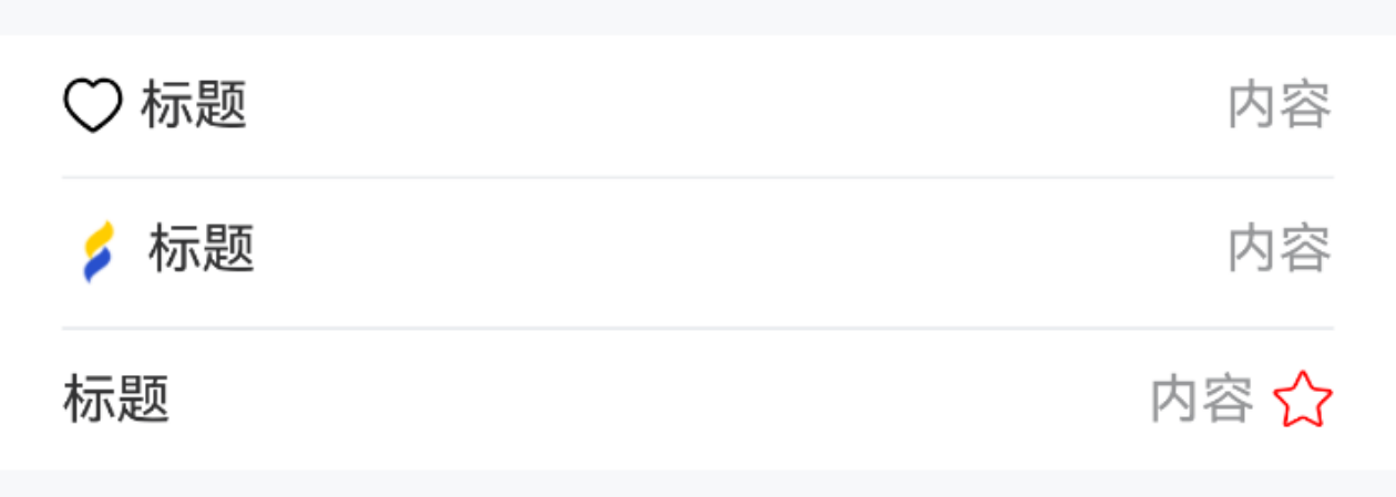
点我查看代码
ts
@Entry
@ComponentV2
struct DemoPage {
  @Builder StarIcon() {
    Image($r('app.media.startIcon')).width(16)
  }
  build(){
    Column(){
      IBestCellGroup() {
        IBestCell({
          title: '标题',
          value: '内容',
          leftIcon: $r("app.media.icon_like")
        })
        IBestCell({
          title: '标题',
          value: '内容',
          iconBuilder: () => this.StarIcon()
        })
        IBestCell({
          title: '标题',
          value: '内容',
          rightIcon: $r("app.media.ibest_icon_star"),
          rightIconColor: '#FF0000',
          hasBorder: false
        })
      }
    }
  }
}
展示箭头
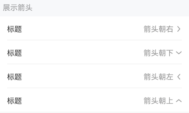
TIP
设置 isLink 属性后会在单元格右侧显示箭头,并且可以通过 arrowDirection 属性控制箭头方向。
点我查看代码
ts
@Entry
@ComponentV2
struct DemoPage {
  build(){
    Column(){
      IBestCellGroup() {
        IBestCell({
          title: "标题",
          value: "箭头朝右",
          isLink: true,
        })
        IBestCell({
          title: "标题",
          value: "箭头朝下",
          isLink: true,
          arrowDirection: "bottom",
        })
        IBestCell({
          title: "标题",
          value: "箭头朝左",
          isLink: true,
          arrowDirection: "left",
        })
        IBestCell({
          title: "标题",
          value: "箭头朝上",
          isLink: true,
          arrowDirection: "top",
          hasBorder: false,
        })
      }
    }
  }
}
必填项
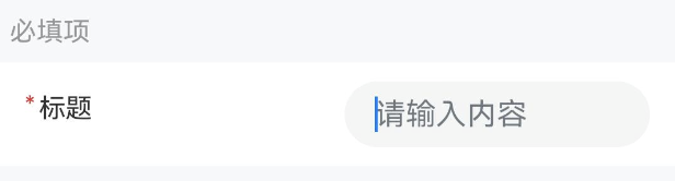
TIP
设置 required 属性后会在单元格左侧显示必填*号。
点我查看代码
ts
@Entry
@ComponentV2
struct DemoPage {
  @Builder InputContain() {
    TextInput({ placeholder: '请输入内容' })
  }
  build(){
    Column(){
      IBestCell({
        title: '标题',
        value: '内容',
        center: true,
        required: true,
        hasBorder: false,
        valueBuilder: (): void => this.InputContain()
      })
    }
  }
}
内容居中
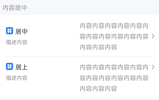
TIP
通过 center 属性可以让 Cell的左右内容都垂直居中。
点我查看代码
ts
@Entry
@ComponentV2
struct DemoPage {
  @Builder StarIcon(width = 16) {
    Image($r('app.media.app_icon')).width(width)
  }
  build(){
    Column(){
      IBestCell({
        title: '居中',
        label: '描述内容',
        value: '内容内容内容内容内容内容内容内容内容内容内容内容内容内容',
        center: true,
        iconBuilder: () => this.StarIcon(),
        isLink: true
      })
      IBestCell({
        title: '居上',
        label: '描述内容',
        value: '内容内容内容内容内容内容内容内容内容内容内容内容内容内容',
        hasBorder: false,
        iconBuilder: () => this.StarIcon(24),
        isLink: true
      })
    }
  }
}
使用插槽
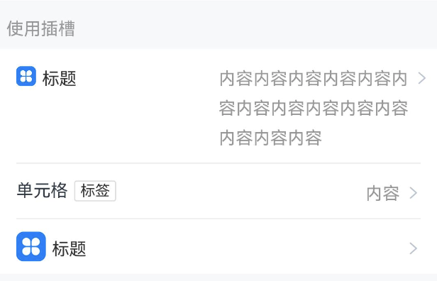
TIP
如以上用法不能满足你的需求,可以使用@BuilderParams插槽来自定义内容。
点我查看代码
ts
@Entry
@ComponentV2
struct DemoPage {
  @Builder StarIcon(height = 24) {
    Image($r('app.media.startIcon')).height(height).margin({ right: 10 })
  }
  @Builder Arrow() {
    Image($r('app.media.title_back')).height(14).margin({ left: 14 }).rotate({ angle: 180 })
  }
  @Builder Title() {
    Row({space: 5}) {
      Text('单元格').fontSize(14)
      IBestTag({ text: '标签' })
    }
  }
  build(){
    Column(){
      IBestCell({
        title: '标题',
        value: '内容内容内容内容内容内容内容内容内容内容内容内容内容内容',
        iconBuilder: (): void => this.StarIcon(16),
        rightIconBuilder: (): void => this.Arrow(),
        clickable: true
      })
      IBestCell({
        titleBuilder: (): void => this.Title(),
        value: '内容',
        rightIconBuilder: (): void => this.Arrow(),
        clickable: true
      })
      IBestCell({
        title: '标题',
        iconBuilder: (): void => this.StarIcon(),
        hasBorder: false,
        rightIconBuilder: (): void => this.Arrow(),
        clickable: true
      })
    }
  }
}
API
CellGroup @Props
| 参数 | 说明 | 类型 | 默认值 |
|---|---|---|---|
| title | 分组标题 | ResourceStr | '' |
| inset | 是否展示为圆角卡片风格 | boolean | false |
| border | 是否显示外边框 | boolean | true |
| radius | 圆角大小, 仅inset为true时有效 | Length | BorderRadiuses | LocalizedBorderRadiuses | 8 |
| titlePadding | 标题内边距 | Padding | Length | LocalizedPadding | 16 |
| outerMargin | 外边距, 仅inset为true时有效 | Padding | Length | LocalizedPadding | { left: 16, right: 16 } |
Cell @Props
| 参数 | 说明 | 类型 | 默认值 |
|---|---|---|---|
| title | 左侧标题 | ResourceStr | '' |
| titleColor | 左侧标题文字颜色 | ResourceColor | #323233 |
| titleFontSize | 标题字体大小 | string | number | 14 |
| value | 右侧内容 | ResourceStr | '' |
| valueColor | 右侧内容文字颜色 | ResourceColor | #969799 |
| label | 标题下方的描述信息 | ResourceStr | '' |
| labelColor | 标题下方的描述信息文字颜色 | ResourceColor | #969799 |
| labelFontSize | 描述信息字体大小 | string | number | 12 |
| cellSize | 单元格大小,可选值为 large normal | string | |
| hasBorder | 是否显示内边框 | boolean | true |
| clickable | 是否开启点击反馈 | boolean | false |
| isLink | 是否展示右侧箭头并开启点击反馈 | boolean | false |
| required | 是否显示表单必填星号 | boolean | false |
| center | 是否使内容垂直居中 | boolean | false |
| arrowDirection | 箭头方向,可选值为 left up down | string | right |
| leftIcon | 左侧图标 | ResourceStr | '' |
| leftIconColor | 左侧图标颜色 | ResourceStr | '' |
| leftIconSize | 左侧图标大小 | string | number | 16 |
| rightIcon | 右侧图标 | ResourceStr | '' |
| rightIconColor | 右侧图标颜色 | ResourceStr | '' |
| rightIconSize | 右侧图标大小 | string | number | 16 |
| leftIconMarginRight | 左侧图标与title间距 | string | number | 4 |
| rightIconMarginLeft | 右侧图标与内容间距 | string | number | 4 |
| leftContentWidth | 左侧内容宽度 | string | number | `` |
| leftRightPadding | 左右padding | string | number | 16 |
| borderSizeType | 底部分割线尺寸类型, 可选值 full center right | string | center |
| borderLeft | 底部分割线left值, borderSizeType 为 right 时有效 | Dimension | 16 |
| bdColor | 底部分割线颜色 | ResourceColor | #ebedf0 |
| arrowSize | 箭头大小 | string | number | 14 |
| arrowColor | 箭头颜色 | ResourceColor | #323233 |
| cellPadding | 单元格内边距 | Length | Padding | LocalizedPadding | 0 |
| valueFontSize 1.1.2 | 右侧内容字体大小 | string | number | 14 |
Events
| 事件名 | 说明 | 事件类型 |
|---|---|---|
| onCellClick | 点击单元格的回调事件 | () => void |
插槽
| 插槽名 | 说明 | 类型 |
|---|---|---|
| titleBuilder | title 的插槽 优先级大于 @Prop title | CustomBuilder |
| valueBuilder | value 的插槽 优先级大于 @Prop value | CustomBuilder |
| labelBuilder | label 的插槽 优先级大于 @Prop label | CustomBuilder |
| iconBuilder | 自定义title左侧icon的插槽, 使用titleBuilder时,该插槽不生效 | CustomBuilder |
| rightIconBuilder | 自定义value右侧icon的插槽, 使用valueBuilder时,该插槽不生效 | CustomBuilder |
主题定制
组件提供了下列颜色变量,可用于自定义深色/浅色模式样式,使用方法请参考 颜色模式 章节,如需要其它颜色变量可提 issue。
| 名称 | 描述 | 默认值 |
|---|---|---|
| ibest_cell_title_color | 标题文字颜色 | #323233 |
| ibest_cell_label_color | 标题下方描述信息文字颜色 | #969799 |
| ibest_cell_value_color | 右侧内容文字颜色 | #969799 |
| ibest_cell_background | 单元格背景色 | #fff |
| ibest_cell_active_color | 单元格按压态背景色 | #f2f3f5 |