CarInput 车牌输入框
介绍
用于输入车牌号码。
TIP
阅读该组件文档前请确保已认真阅读快速上手章节的每一个字。
引入
ts
import { IBestCarInput } from "@ibestservices/ibest-ui-v2";代码演示
基础用法

点我查看代码
ts
@Entry
@ComponentV2
struct DemoPage {
@Local value: string = ''
build() {
Column(){
IBestCarInput({
value: this.value!!
})
}
}
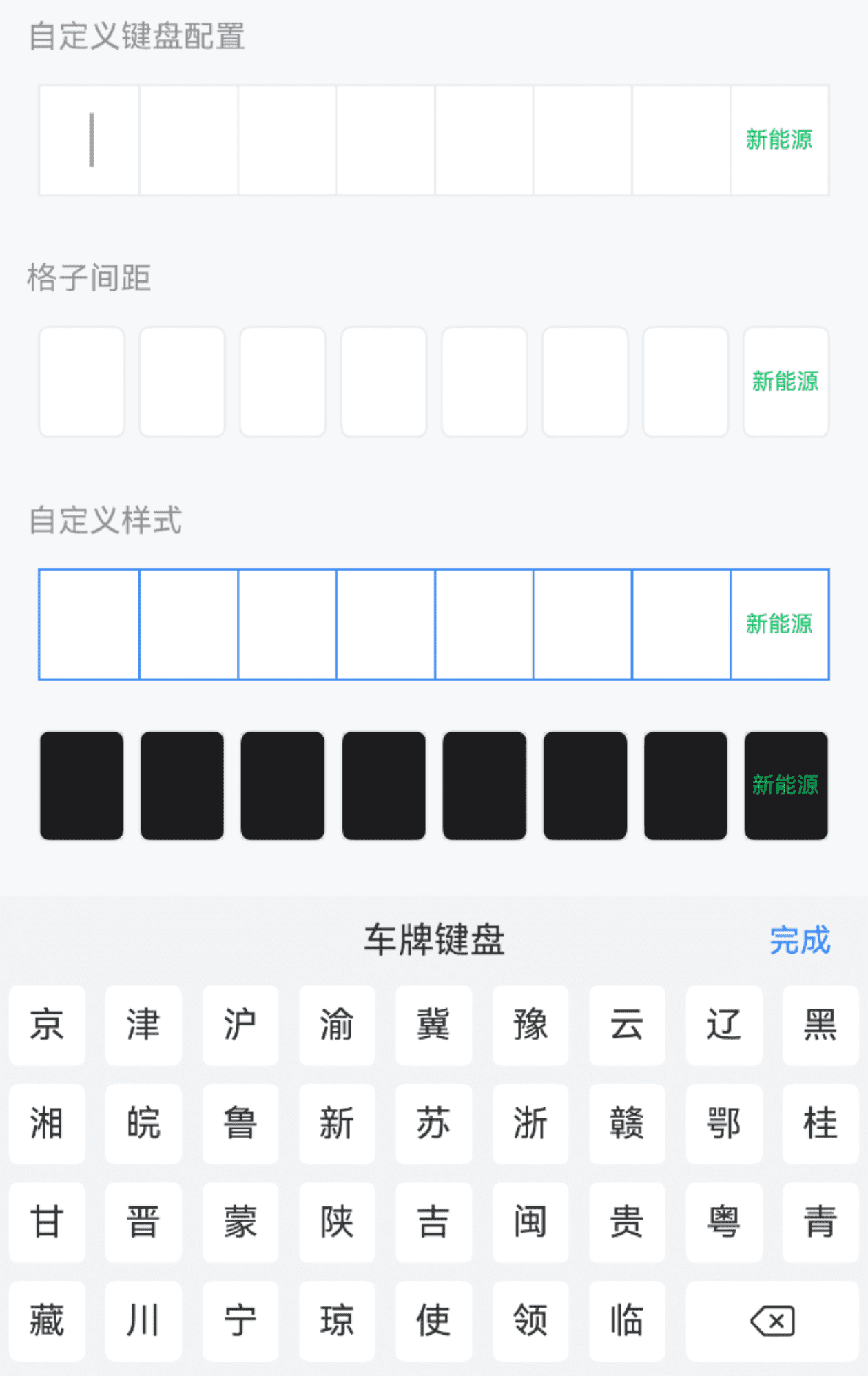
}自定义键盘配置
点我查看代码
ts
@Entry
@ComponentV2
struct DemoPage {
  @Local value: string = ''
  build() {
    Column(){
      IBestCarInput({
        value: this.value!!,
        keyboardConfig: {
          title: '车牌键盘',
          keyHeight: 36
        }
      })
    }
  }
}
格子间距

TIP
通过 space 属性可以设置格子间距, 以下属性仅在space不为0时生效:
• radius 设置单个格子圆角;
• isHighlightCurrent 设置是否高亮当前正在输入的格子;
• highlightColor 设置高亮颜色。
点我查看代码
ts
@Entry
@ComponentV2
struct DemoPage {
@Local value: string = ''
build() {
Column(){
IBestCarInput({
value: this.value!!,
space: 6
})
}
}
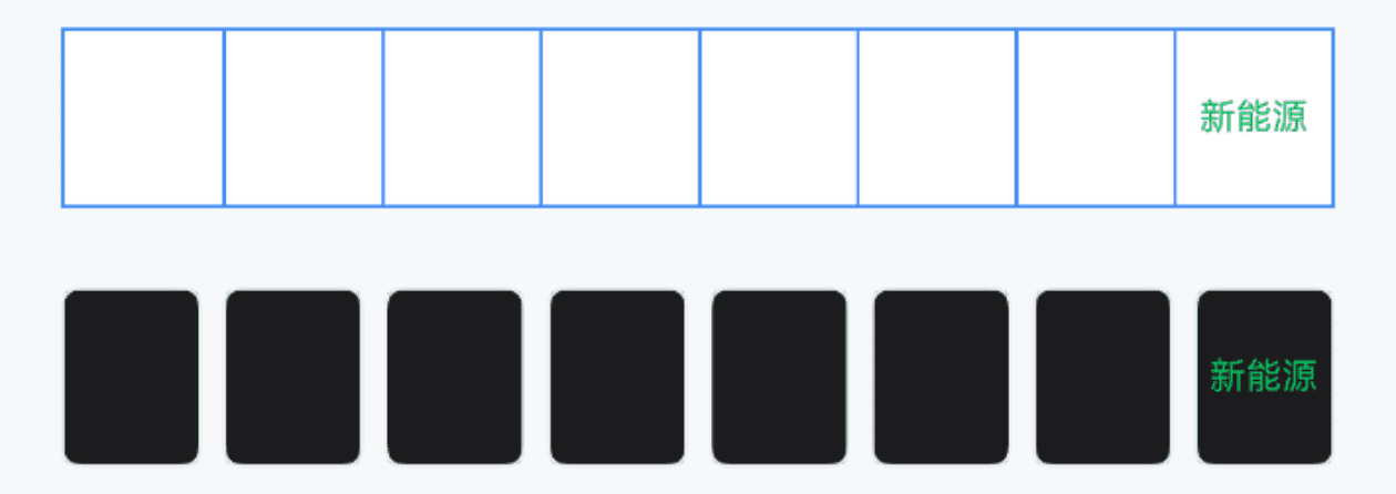
}自定义样式
点我查看代码
ts
@Entry
@ComponentV2
struct DemoPage {
  @Local value: string = ''
  build() {
    Column({space: 14}){
      IBestCarInput({
        value: this.value!!,
        bdColor: '#3d8af2',
        textColor: '#3d8af2',
        cursorPosition: "bottom",
        cursorColor: "#3d8af2"
      })
      IBestCarInput({
        value: this.value!!,
        space: 6,
        bgColor: "#1c1c1e",
        textColor: "#fff",
        highlightType: "shadow"
      })
    }
  }
}
API
@Props
| 参数 | 说明 | 类型 | 默认值 |
|---|---|---|---|
| value | 当前输入框的值, 支持双向绑定 | string | '' |
| autoFocus | 自动聚焦 | boolean | false |
| showCursor | 是否显示闪烁光标 | boolean | true |
| cursorPosition | 光标位置, 可选值为 center bottom | string | center |
| cursorColor | 光标颜色, 默认跟随字体色 | ResourceColor | `` |
| inputHeight | 输入框高度 | string | number | 50 |
| space | 格子间距 | string | number | 0 |
| radius | 格子圆角,当 space 不为0时有效 | string | number | 5 |
| isShowBorder | 是否显示边框线 | boolean | true |
| bdColor | 边框线颜色 | ResourceColor | #ebedf0 |
| bgColor | 背景色 | ResourceColor | #fff |
| textColor | 文字颜色 | ResourceColor | #323233 |
| fontSize | 文字大小 | string | number | 20 |
| isHighlightCurrent | 是否高亮当前正在输入的格子,当 space 不为0时有效 | boolean | true |
| highlightType | 格子高亮类型, 可选值为 shadow border | string | border |
| highlightColor | 格子高亮颜色,当 space 不为0时有效 | ResourceColor | #3D8AF2 |
| keyboardConfig | 自定义键盘配置项 | IBestCarKeyboardConfig | - |
IBestCarKeyboardConfig 数据结构
| 参数 | 说明 | 类型 |
|---|---|---|
| title | 键盘标题 | string |
| confirmBtnText | 确认按钮文字 | string |
| keyHeight | 按键高度 | string | number |
Events
| 事件名 | 说明 | 事件类型 |
|---|---|---|
| onConfirm | 点击完成触发 | () => void |
主题定制
组件提供了下列颜色变量,可用于自定义深色/浅色模式样式,使用方法请参考 颜色模式 章节,如需要其它颜色变量可提 issue。
| 名称 | 描述 | 默认值 |
|---|---|---|
| ibest_car_input_background | 输入框背景色 | #fff |
| ibest_car_input_text_color | 输入框文字颜色 | #323233 |
| ibest_car_input_border_color | 输入框边框色 | #ebedf0 |