Badge 徽标
介绍
在右上角展示徽标数字或小红点。
TIP
阅读该组件文档前请确保已认真阅读快速上手章节的每一个字。
引入
ts
import { IBestBadge } from "@ibestservices/ibest-ui-v2";代码演示
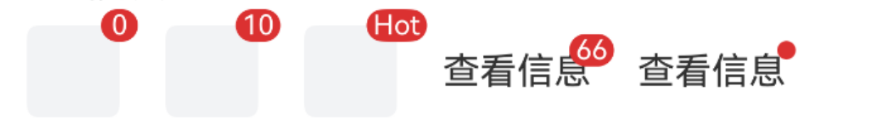
基础用法
点我查看代码
ts
@Entry
@ComponentV2
struct DemoPage {
@Builder badgeContent() {
Row()
.width(40)
.height(40)
.borderRadius(5)
.backgroundColor("#f2f3f5")
}
build() {
Row({space: 20}) {
IBestBadge({
content: 0
}){
this.badgeContent()
}
IBestBadge({
content: 10
}){
this.badgeContent()
}
IBestBadge({
content: "Hot"
}){
this.badgeContent()
}
IBestBadge({
content: 66
}){
Text("查看信息")
}
IBestBadge({
dot: true
}){
Text("查看信息")
}
}
}
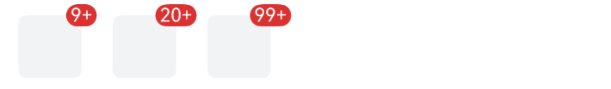
}最大值
点我查看代码
ts
@Entry
@ComponentV2
struct DemoPage {
  @Builder badgeContent() {
    Row()
      .width(40)
      .height(40)
      .borderRadius(5)
      .backgroundColor("#f2f3f5")
  }
  build() {
    Row({space: 20}) {
      IBestBadge({
        content: 20,
        max: 9
      }){
        this.badgeContent()
      }
      IBestBadge({
        content: 50,
        max: 20
      }){
        this.badgeContent()
      }
      IBestBadge({
        content: 200,
        max: 99
      }){
        this.badgeContent()
      }
    }
  }
}
自定义颜色

点我查看代码
ts
@Entry
@ComponentV2
struct DemoPage {
  @Builder badgeContent() {
    Row()
      .width(40)
      .height(40)
      .borderRadius(5)
      .backgroundColor("#f2f3f5")
  }
  build() {
    Row({space: 20}) {
      IBestBadge({
        content: 5,
        color: '#1989fa'
      }){
        this.badgeContent()
      }
      IBestBadge({
        content: 10,
        color: '#1989fa'
      }){
        this.badgeContent()
      }
      IBestBadge({
        dot: true,
        color: '#1989fa'
      }){
        this.badgeContent()
      }
    }
  }
}
显示图标
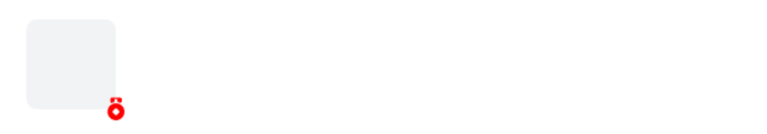
点我查看代码
ts
@Entry
@ComponentV2
struct DemoPage {
@Builder badgeContent() {
Row()
.width(40)
.height(40)
.borderRadius(5)
.backgroundColor("#f2f3f5")
}
build() {
Row({space: 20}) {
IBestBadge({
icon: "medal",
iconColor: Color.Red,
badgePosition: "bottom-right"
}){
this.badgeContent()
}
}
}
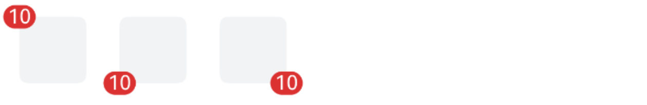
}自定义徽标位置
点我查看代码
ts
@Entry
@ComponentV2
struct DemoPage {
  @Builder badgeContent() {
    Row()
      .width(40)
      .height(40)
      .borderRadius(5)
      .backgroundColor("#f2f3f5")
  }
  build() {
    Row({space: 20}) {
      IBestBadge({
        content: 10,
        badgePosition: "top-left"
      }){
        this.badgeContent()
      }
      IBestBadge({
        content: 10,
        badgePosition: "bottom-left"
      }){
        this.badgeContent()
      }
      IBestBadge({
        content: 10,
        badgePosition: "bottom-right"
      }){
        this.badgeContent()
      }
    }
  }
}
API
@Props
| 参数 | 说明 | 类型 | 默认值 |
|---|---|---|---|
| content | 徽标内容 | string | number | '' |
| color | 徽标背景色 | ResourceColor | #DB3131 |
| dot | 是否展示为小红点 | boolean | false |
| max | 最大值,超过最大值会显示 {max}+,仅当 content 为数字时有效 | number | -1 |
| showZero | 值为0时是否显示徽标 | boolean | true |
| badgePosition | 徽标位置, 可选值 top-left top-right bottom-left bottom-right | string | top-right |
| icon | 徽标图标, 优先级高于 content dot | ResourceStr | '' |
| iconColor | 徽标图标颜色 | ResourceColor | '' |
| iconSize | 徽标图标大小 | string | number | 12 |
| xOffset 1.1.2 | 徽标x轴偏移量 | Dimension | 0 |
| yOffset 1.1.2 | 徽标y轴偏移量 | Dimension | 0 |
插槽
| 插槽名 | 说明 | 类型 |
|---|---|---|
| defaultBuilder | 默认内容的插槽 | CustomBuilder |
主题定制
组件提供了下列颜色变量,可用于自定义深色/浅色模式样式,使用方法请参考 颜色模式 章节,如需要其它颜色变量可提 issue。
| 名称 | 描述 | 默认值 |
|---|---|---|
| ibest_badge_background | 徽标背景颜色 | #ee0a24 |
| ibest_badge_text_color | 徽标文字颜色 | #fff |